Even though transactional emails see 8x more opens and clicks than any other type of email — and can generate 6x more revenue — it’s shocking to see how many companies fall short. In our unboxing blog series we take a look at the transactional emails of the biggest and most popular retailers. Join us to see what’s working, what’s not, and apply these learnings to your own transactional emails.
Spending Time with BarkBox
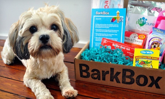
BarkBox, a company full of self-described “crazy dog people,” offers a monthly subscription box of themed dog toys and treats. They’ve been delivering happiness to dog lovers around the world since 2012 and they also have an e-commerce “BarkShop” where you can purchase your favorite items a la carte.
When it comes to marketing, BarkBox knows how to deliver the goods. On social, they’ve mastered the art of the dog meme. This funny, relatable, and bingeworthy content is extremely shareable and succeeds at hitting their ever-growing target audience, millennial dog owners.
BarkBox’s display ads and emails serve a purpose that is a bit lower in the funnel. These pieces almost always contain the two most important things, dogs and product, which essentially links the two in the user’s mind. You can’t have one without the other.

The BarkBox Purchase Experience
We know what BarkBox is about when it comes to marketing, but do their transactional emails sync up? Let’s take a look.
The MailCharts data team purchased a single month BarkBox for $29 plus tax with free shipping. From the time of purchase through the first 30 days, BarkBox sent us only seven emails, which is fairly low compared to other retailers from our unboxing series.
We’ll take a closer look at three of those emails here, but to see all the emails sent to a purchaser, as well as the subscription abandoner user flow, sign up for MailCharts.
A Fun Order Confirmation

As expected, the BarkBox Order Confirmation email aligns with the rest of its marketing experience by taking two opportunities to show dogs and product together, once in the header and again in the footer.
The “Yeeepawww” intro copy is on-brand and playful. We also like the way they include information about automatic renewal and shipping info upfront. In the invoice section, however, we would like to have seen the last four digits of our purchasing card as a quick confirmation.
The “Go BarkShopping” CTA is a nice “Did you know” opportunity for cross-selling. We also like that they have two clear options for accessing FAQs from this initial email.
Next we’ll skip ahead a few emails to the “We hope you loved it” email that came 13 days later (after we received the product).
A Follow-Up Email with a Personal Touch

The next email we received from BarkBox switched things up a bit. Here we find a warm, rich-text email that looks as if it was sent from a friend checking in on us. No doubt this is intentional.
This email does a good job of sharing upsell opportunities, but disguising them as preferences like allergy-friendly and Heavy Chewer, so that it doesn’t feel promotional.
One thing we would have done differently is reduced or condensed the number of links, as this email is a bit link-heavy as is.
Twenty-three days later, when our billing information was being processed for renewal, we received this email.
The Uh-Oh! Email

Because BarkBox is a subscription-based service, they sometimes have to send gentle reminder emails to their users to ensure prompt payment. This accounts receivable process is called “dunning.”
That’s what this message is. Note that there are two CTAs encouraging us to update our billing info (one in the header and one larger CTA in the body.)
It’s also helpful that they included a clear “Contact BarkBox” CTA in this email in case we have questions. This is also good for business because it allows their customer service team a chance to prevent cancellations.
The BarkBox Unboxing Experience

The BarkBox unboxing experience is very exciting and high-energy because dogs tend to become familiar with the toy- and treat-filled goodie boxes. For more on what this looks like, check out the #BarkBoxDay hashtag on social media.


To align with this month’s safari theme, BarkBox used custom map-like packaging.

Along with the products, BarkBox includes a quick resource guide for dog owners that outlines everything they received along with fun, playfully illustrated “How to BarkBox” instructions.

Let the games begin!
Update: Video unboxing
We’ve teamed up with our friends at Lumi to bring you this great unboxing experience. Check it out:
The BarkBox purchaser email experience is pretty cohesive with their overall branding and marketing efforts. We like the way they keep things fun and playful while remaining dog- and product-centric.
To see more data on BarkBox’s email strategies as well as data from 30,000+ other companies, join MailCharts today!


