Browse-abandoner emails are much like cart abandoner emails: triggered when a known visitor has viewed a product on the website but didn’t add it to a cart.
This data is often collected and passed to an email service provider (ESP) so that teams can trigger browse-abandoner emails. While these emails don’t indicate purchase intent as clearly as cart-abandoner emails, they still serve relevant content to entice shoppers back to the site either to purchase the item or to view similar items.
Cadence-wise, these emails should hit the subscriber’s inbox soon after abandonment. The examples we’ll walk through below contain a few emails over a maximum 3-day period, with the first email sent within 2 hours of abandonment.
Here are a few favorites picked by our data team:
Don't just look – bring this home!
Travis Mathew takes a traditional approach to browse-abandoner emails: with a large image of the item that was being viewed as well as like products. Adding these related products brings users back to the site to consider purchasing other items instead of (or in addition to) the item they previously viewed. They follow a two-email cadence with Email One going out 2 hours after abandonment and Email Two going out a day later.
Hey Clinton, you forgot one important step.
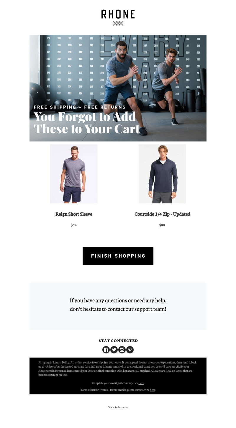
Rhone takes a less aggressive approach by sending only one email 2 hours after abandonment. This email is pretty bare-bones but cuts right to the chase: Don’t forget to add these picks to your cart. They also have a link to reach out to their customer support team and add first-name personalization to the subject line, which is a nice touch.
Glasses Direct (United Kingdom)
Having trouble choosing?
Like Rhone, Glasses Direct sends one browse-abandoner email, but it goes out 30 minutes after abandonment. We like how this brand uses the playful subject line to ask “Having trouble choosing?” and has optimized preheader text that supplies a phone number and asks the recipient to “Call us”. They also include first-name personalization within the email. The rest of the email is pretty standard in terms of what we expect to see in browse-abandoner emails.
We saw you lookin’
Fenty Beauty sends three emails over three days, starting an hour after abandoning. Fenty Beauty packs a lot of additional information into this email, including Instagram feed inspiration, a CTA to sign up for text updates, and their shipping and return policy for a risk-free purchase. This is refreshing content to see, providing more value to the shopper than typical browse-abandoner messaging.
Like cart abandoners, these browse-abandoner emails don’t need a lot of frills to provide value. If you’re itching to add browse-abandonment emails to your list of automated emails, take a look at some additional examples in our list of curated emails.
Editorial image by obpia30 from Pixabay


