In a world where every sale counts and marketing budgets are tight, your brand needs a solid onboarding journey to create a loyal customer base. You might be wondering how onboarding emails differ from welcome emails. Generally, welcome emails are part of a larger onboarding journey and are used primarily in subscription-based companies or rewards programs.
Onboarding journeys typically include more details about a brand’s products or offerings, while welcome emails just scratch the surface. Think of your welcome email as your first impression on a first date and the onboarding journey as your second date. By date two, you’re ready to open up more.
We’ve combed through hundreds of onboarding emails to bring you the best of the best. Take a look at some of our favorites below:
Disney+
Get started with Disney+
Two days after account creation, Disney+ subscribers receive a “getting started” email. This email is the perfect introduction after receiving the welcome email a day before.
In this email, Disney+ offers important details, such as how to stream on multiple devices at once as well as downloading content for on-the-go viewing. This email does a good job of keeping text short, sweet, and to the point. From a consumer’s point of view, it’s easy to skim and digest the content. In future emails, Disney+ continues to highlight users’ ability to download videos as a unique feature offered to its subscribers.
Birchbox
Birchbox splits out its four-email onboarding journey into specific topics: welcome, personalize, shop, and connect. In its welcome email, it shares with users how the subscription service works once they’ve provided their preferences in their beauty profiles.
Welcome to Birchbox!
The next email dives into how users can personalize their boxes. With email three, Birchbox talks about its online shop where users can purchase full-size products. The final onboarding email promotes its social media and how to stay up on trends with the online magazine.
We love this series because it focuses attention on one topic at a time: making it easy for customers to quickly glance and understand the email’s purpose.
Home Chef
Home Chef uses simple visuals within its onboarding journey to tell a story. In the first onboarding email, the brand creates a straightforward table of the customer’s receipt. This visual is easy to read and consists of only essential details.
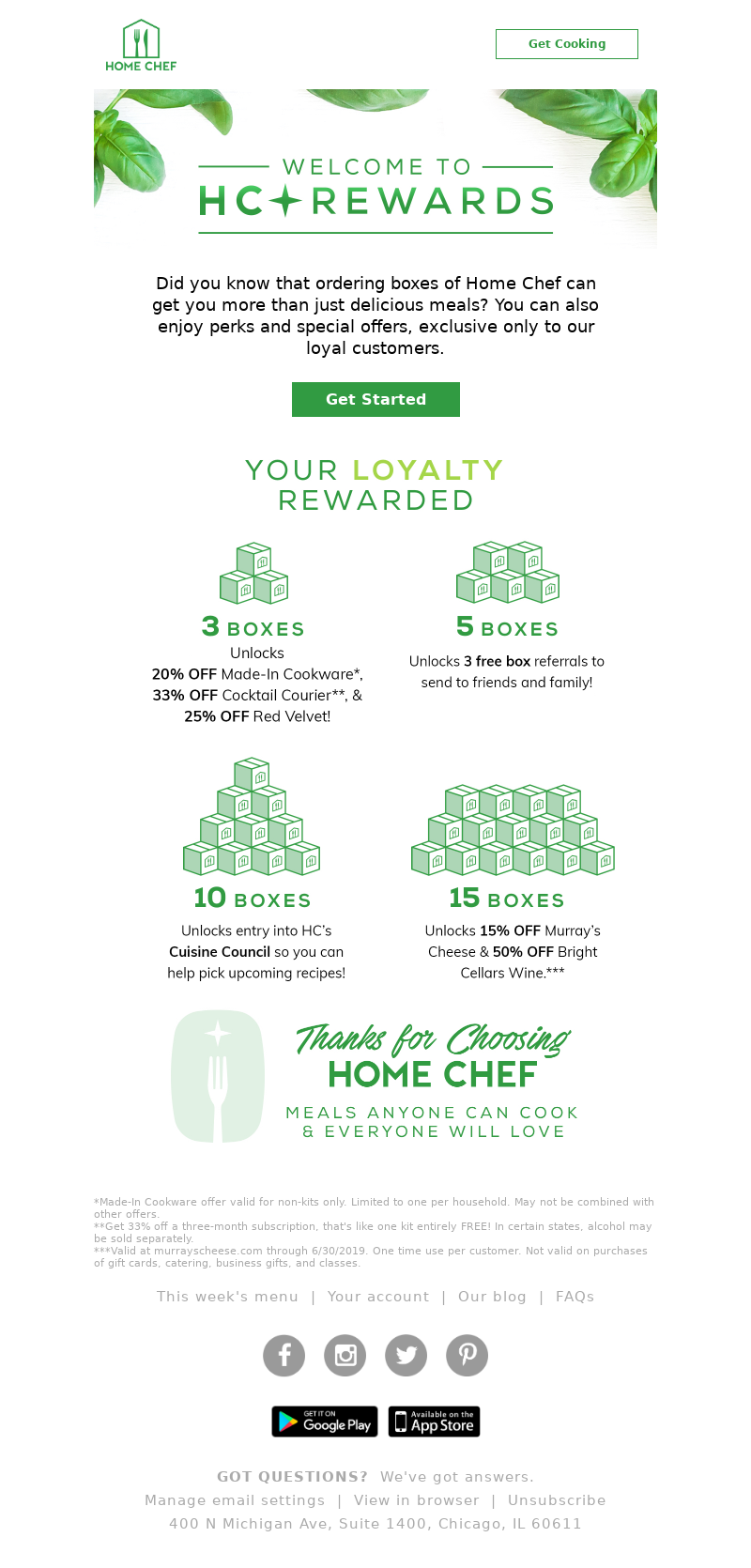
In email two, Home Chef uses box illustrations to show how the different tiers of its rewards program work:
Get rewarded for your Home Chef loyalty!
We love these emails because they simplify things into digestible bits of information, similar to the Birchbox and Disney+ approaches.
Key Takeaways
Working on your brand’s onboarding journey emails? Here are a few takeaways from the examples we walked through:
- Keep the text short, sweet, and to the point so that readers can skim your email quickly.
- Focus on one topic per email to keep your audience focused.
- Lean on illustrations to tell a story and simplify your message.
If you’re looking for more inspiration, check out our curated list of onboarding emails or sign up to track emails from up to three companies at one time.
Editorial image by Paul Brennan from Pixabay


