Cart abandonment email examples and best practices
Abandoned cart emails are an effective reminder to customers to complete their purchase and are critical to every triggered email program.
Explore all 460 cart abandonment emails
Sign-up for MailCharts to discover cart abandonment campaigns and get inspired!
Pro tip: Scroll down for hand-picked emails.
The abandoned-cart email campaign is one of the most effective email sequences your ecommerce business can send. It matches up with a key point on the customer journey—when a shopper chooses a product and adds it to a cart but leaves your site before buying—and speaks to something your customer did on your site. That makes it even more relevant than a personalized promotional campaign.
Whether you’re creating your first abandoned cart email campaign or upgrading your current program, you can use this curated collection of share-worthy email examples and strategic advice to guide your planning.
An abandoned cart workflow is triggered when a customer abandons a cart. The workflow can consist of a single email or a multi-email abandonment series. They go out automatically according to the rules you specify, so they run in the background, requiring no added effort from you or your team.
An abandoned cart email reminds customers to complete the checkout process and recover lost sales for your online store. That’s why an abandoned-cart email can also be called a “recovery email.”
Cart Abandonment Email Examples and Strategies
- 1 Two-email recovery series
- 2 The cost of missing out
- 3 Bringing the social proof
- 4 Helping customers buy
- 5 Adding more assurance
- 6 Using dynamic copy
- 7 Capturing attention with emojis and animation
- 8 Adding relevant product recommendations
- 9 Promoting the discount
- 10 FOMO, but make it fun
- 11 Updating a price
- 12 Sharing brand values
- 13 Instilling confidence
- 14 Let's have fun!
- 15 Reaching out via SMS
Abandoned Cart Email Strategies
- 1 Include essential information
- 2 Send an abandoned cart email series
- 3 Choose a tone of voice for your emails
- 4 Start off with a strong email subject line
- 5 Create a meaningful call to action
- 6 Be strategic about incentive
- 7 Reduce purchase uncertainty
- 8 Update email templates as needed
- 9 Invest in your abandonment message copy
- 10 Create urgency
- 11 Include social proof to boost shopper confidence
- 12 Pair your email strategy with SMS
- 13 Test your emails and series to learn more about your customers
- 14 Avoid triggering abandoned-cart reminders

The freshest abandoned cart email examples at your fingertips
Sign up for MailCharts to discover our collections of the best abandoned cart email examples from leading ecommerce brands
Abandoned Cart Email Examples and Strategies
Let’s get this out in the open right away: you don’t need to offer discounts to make abandoned cart emails work. Sure, the most popular technique to win back cart abandoners is offering a discount, but our analyses of 100s of abandoned cart emails reveals there’s a lot more to consider! Check out these abandoned cart email campaign examples:
Two-email recovery series
Sweaty Betty’s two-email sequence leans heavily on strong images. Instead of dropping the usual catalog images pulled from website product pages, each email shows a model wearing the actual product the customer abandoned. The first email begins with a playful subject line (“Hey, you left me in your cart”). The second email is more action-oriented (“Make me yours before someone else does.”) What doesn’t Sweaty Betty do? Dangle a discount to entice shoppers back. Bold move!
Sign up free for 460 curated examples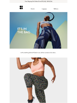
The cost of missing out
This cart reminder begins with a grabber subject line: “Your personalized mug could have been done today…” The message reminds the abandoner that they could have had their personalized products in their hands sooner had they not left without buying. This simple message is a tiny powerhouse of urgency, from the first-person copy (“I could not send you your personalized mug because …”) to the warning that the 10% discount expires in 12 hours. It also includes customers enjoying the mugs they bought and other personalized products along with its Trustpilot rating.
Sign up free for 460 curated examples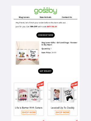
Bringing the social proof
Each of the four emails in Boka’s abandoned cart email series features a different customer comment. But they aren’t just any old four-star review. Each review supports the product benefit highlighted in that particular email. Each review directs attention to the product’s value and supports a benefit mentioned in the email. Additionally, each email also focuses on different product attributes instead of pushing a sale or telling customers to go back and finish checking out. The combination gives wavering customers more support for completing the transaction.
Sign up free for 460 curated examples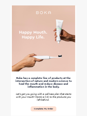
Helping customers buy
This PureFormulas email illustrates why reviews alone aren’t often enough to help shoppers feel more confident about buying. While the email copy stresses completing the transaction, it also includes a phone number customers can use to ask questions and be sure they’re buying the right item. Not only can it drive more completed sales, adding customer-service contacts can also reduce returns. A customer FAQ is an alternative, but sometimes talking to a live human is better at sealing the deal.
Sign up free for 460 curated examples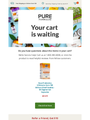
Adding more assurance
Reducing your customers’ concerns makes it easier for them to buy from you. Ecco’s recovery email takes on the fear of returning a product that doesn’t work out by offering free shipping and returns. Lots of emails use just a little icon in the footer to promote this benefit, but Ecco builds the email around it. Bonus: The email also notes the benefit is only for “registered” customers. It’s a great incentive for customers to give you some of the first-party data you need to create more relevant messages.
Sign up free for 460 curated examples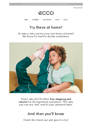
Using dynamic copy
Product recommendations are one way of persuading customers to find a product that’s a better fit. We also like the way Columbia uses a dynamic copy module to promote a seasonal sale as a way to bring back shoppers who might think they overlooked some good deals. This might sound as if you’re creating work yourself by updating your templates every time you add a sale. Not so! A dynamic module allows you to swap in content as needed without rebuilding the whole template. Tip: You can use this same tactic in your browse-abandonment emails.
Sign up free for 460 curated examples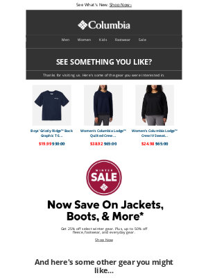
Capturing attention with emojis and animation
Nobody ever said abandoned cart emails have to be boring. Want to toss an emoji into a subject line? It works for Krispy Kreme: “Doughnuts are waiting 🍩.” With so many fun new emojis having been added over the last few years, and more email clients displaying them correctly, you can make a big impact in a small space. But don’t stop there. Add some animation to the message itself, the way Chanel does with this abandoned-cart message, which captures attention at the top of the email and directs it down to the product left in the cart. (View the full email.)
Sign up free for 460 curated examples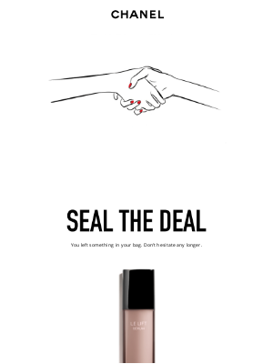
Adding relevant product recommendations
We picked this Coach email for you because its product recommendations relate so closely to the item in the customer’s cart. This is one way recommendations in a cart-abandonment email differ from those in a browse-abandonment or promotional email. A bunch of random products can be confusing to a focused shopper. A select set of recommended products could bring back customers who didn’t find quite the right product the first time. Here, each item in the product array relates to the item in the cart but is just different enough to offer a real choice.
Sign up free for 460 curated examples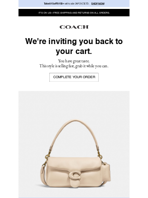
Promoting the discount
Speaking of discounts, they don’t have to be your opening offer to bring a shopper back to your site. But if you’re offering one, be super-obvious about it. Children’s footwear brand See Kai Run gets right to it in the subject line: “Still Thinking it Over? Shipping’s on us!” Then, in the body of the email, the offer is revealed in a red reverse bar across the top of the message, specifying the offer terms. It also highlights the coupon code – likely a necessary move because it’s a 14-character code instead of an easily remembered word.
Sign up free for 460 curated examples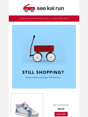
FOMO, but make it fun
Varley uses a clever animation—a rapidly emptying clothes rack—to remind customers that items they bought are selling out and their carts are expiring. It’s a clever way to induce FOMO without calling it out directly or employing overused terminology like “Hurry!” or “Time’s running out.”
Sign up free for 460 curated examples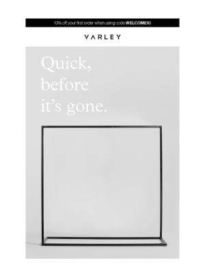
Updating a price
“Price drop:” Two of the sweetest words a shopper could see in the inbox. This email from Houzz comes with the subject line “Price drop on 100% Solid Wood 4+2 or 6-Drawer Chest, Mocha in your cart!” This is a great example of automation in action, because it inserts the product name in the subject line. If your CRM allows persistent carts, you can set rules that trigger follow-up emails on carted products when prices change. This tactic also has a flip side—if a customer carts a product on sale, you can send an alert before the price goes back up. Three other things to note in this email: It provides a unique coupon code; it shows both the regular and discount prices and lists the number of items in stock.
Sign up free for 460 curated examples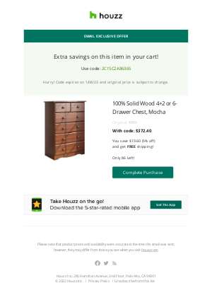
Sharing brand values
Home goods brand Coyuchi puts its values front and center in Email two of its three-email series. It’s a move that can both assure customers who are uncertain about product quality and appeal to those who want to buy from brands that share their personal values. It can be persuasive for customers who aren’t motivated just by lower prices, especially Millennials and Gen Z. It’s also another argument for running a multi-email abandoned cart series instead of a single reminder. You can dedicate one of those emails to your brand story—your origin story, what causes you support, how your products support your values.
Sign up free for 460 curated examples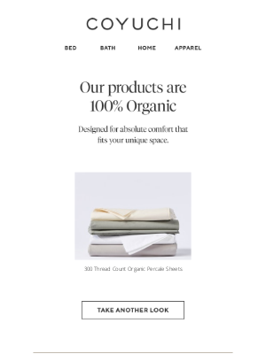
Instilling confidence
This Coyuchi email illustrates why helping customers buy the right product the first time can remove another barrier in the purchase process. The brand adds detailed buying guides to every abandoned-cart email in its series and explains exactly what customers should be looking for: “the exact weight, warmth and overall design.” For customers who are waffling on their choices or worried about paying for a high-value product, these extra reassurances can increase conversions and reduce returns.
Sign up free for 460 curated examples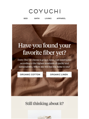
Let's have fun!
If your brand image is playful, why send a recovery email that sounds as if a robot wrote it? We dare you to resist BarkShop’s clever four-email series, especially this animated email three, which adds a sad puppy for a smidge of guilt to the process. The CTA stands out against the animation thanks to a clever caricature, and other important features (relevant product recommendations and a link to customer support makes this a seriously fun abandonment email. Discover the complete email series.
One caution: Make sure you know your customers well enough to know whether they would respond to humor.
Sign up free for 460 curated examples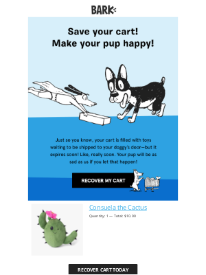
Reaching out via SMS
SMS messages can be just as effective as email in reaching customers who abandon carts. MVMT sends a simple cart reminder and a link back to the customer’s cart. Message restrictions can limit what you include in your text (MMS messages cost more and might have rendering issues on your recipient’s device). So choose short, punchy copy that focuses on the benefit of buying, not just going back to the cart.
Sign up free for 460 curated examples
The freshest abandoned cart email examples at your fingertips
Sign up for MailCharts to discover our collections of the best abandoned cart email examples from leading ecommerce brands
Cart Abandonment Email Strategy
Use the examples above as inspiration for your own abandoned cart email campaigns and combine them with the best practices below to create an abandonment series that brings more customers back to buy.
Include essential information
Shoppers, especially those who have never purchased your brand before, might not understand why you’re emailing them about their abandoned carts. Include as much detail as you can, especially in your first message in a multi-email abandonment journey, to remind them about the products they left behind and encourage them to come back and check out.
Include these points in your email—or in the first email of a multi-email series:
- Product names of the abandoned items
- Product images
- Product information, such as price, size, and color
- A clear call to action
- Contact email or phone number for help
The more informative you are in your email, the more likely you’ll give your customers reasons to return.
Send an abandoned cart email series
Sending one cart reminder is better than sending none. But sending more than one reminder is even better. Many brands have developed a three-email abandoned-cart email series because it gives you more opportunities to reclaim more lost customers:
Email 1: (One hour after abandonment) Kick off the process with a gentle reminder to return and complete checkout.
Email 2: (24 hours after email one). Answer questions, explain brand values, recommend product alternatives, or share customer reviews or social media comments.
Email 3: (Up to seven days after email two) Offer an incentive or another tactic to bring the customer back.
Choose a tone of voice for your emails
Before you get down to tactics like subject lines and calls to action, think about what you want to convey with your abandonment emails. Should they imply “Get back here and check out!” Or would you get better results with a helpful approach that says, “We’re here to solve problems and help you achieve your objective?”
All of the elements in your abandonment email or series should align with that tone of voice, from the subject line to the call to action, the message to the information points you include in the copy.
To discover which approach is more effective, build at least two versions – such as one that focuses on helpfulness or solving problems and another that uses FOMO. Be sure all elements of your message align with that voice, from the subject line to the CTA.
Start off with a strong email subject line
Remember that you’re sending an unexpected message into a customer’s crowded inbox where it will need to stand out against emails they want, emails they don’t want, and—if they subscribe to your promotional messages—emails from your own brand.
Regular ecommerce buyers probably expect to see your abandonment or recovery email, but that doesn’t mean everyone does. You could short-circuit your efforts with a subject line that’s too vague or cutesy or too far out of line with what customers expect from your brand.
Here are some subject lines we pulled from our collection of abandoned cart email examples. Which would you want to open, and which could turn you off or fade into the background?
Hey Bestie, forget to check out?
Psst! Your order is waiting for you!
Your cart is about to expire
Make me yours before someone else does
Your order status
Did you forget about this, Ashley?
Don’t assume the subject line styles in your promotional emails will also motivate customers to act on triggered messages. Test several styles to learn what works best.
Create a meaningful call to action
No matter what wording you use in your CTA, it should align with your message voice and also tell your customers what you want them to do. It’s tempting to say “Complete checkout” but is that going to resonate with time-pressed customers?
Look beyond just sending lost customers back to their carts. Instead, tell them what great things will happen when they finally get their hands on their purchases. “Finish Your Project” is a great CTA from Snapfish. Another testable concept—putting an incentive in the CTA as well as the message copy.
Here’s another collection of CTAs from our abandonment email collection. What do you think?
Return to bag
Shop Now to Redeem
Complete My Order
Shop Now
Resume My Order
Ready When You Are
Let’s Keep Shopping
Get Your Gear
Be strategic about incentive
Have we trained customers to wait for the abandonment cart email with a juicy incentive? We can debate that point, but in the meantime, be cautious about scattering coupon codes too soon or too often in your abandonment series.
As we noted previously, discounts cut into your profits. Bargain-hunting customers will wait out your email sequence until your incentive arrives. And not everyone is motivated by money. Do your best customers need that pricey incentive if they regularly pay full price? Some shoppers need more information or want to compare prices from other brands. Others get interrupted, run into technical difficulties or use carts like wish lists, parking items until they’re ready to buy.
A generally accepted best practice is to hold off on a coupon code or other incentive until the last email in a multi-email series. If you send only a single recovery email, you can add an incentive, but don’t focus the email around it.
Timing is just the start. Should that incentive be a price discount? Dollars off? Free shipping? Free returns or exchanges? Test several incentives to see which ones deliver the most purchases at the lowest cost.
Reduce purchase uncertainty
Many shoppers need to be sure they’re buying the right thing or know they can exchange a product or get their money back if they bought the wrong thing.
Your abandoned-cart emails should reinforce all of the fail-safe measures you list on your website to be sure customers are satisfied and confident about what they’re buying. Highlight these reassurances in your messages with copy (not just little icons at the bottom of the message):
- Your return/exchange policy
- Customer-support contacts
- Buyer’s guides or FAQs
- Free shipping and returns if you offer them
Assure shoppers that you’ll help them buy the right product or fix mistakes. You’ll have happier customers (meaning fewer post-purchase call-center contacts and fewer returns).
Update email templates as needed
Create a template for each kind of abandonment email you send. Besides the email examples on this page, MailCharts gives subscribers plenty of resources for email inspiration for designing or updating an abandonment journey. Here are three:
- Our curated list of email examples pulled from active abandonment journeys
- A searchable database of journeys that show you all the emails in a specific brand’s abandonment series and the messaging schedule for multi-email campaigns
- A searchable database of brands and all the journey messages we have received from each brand over the years, including welcome, abandoned-cart, abandoned-browse and purchase journeys
After you create and test your templates, your rules will send emails according to the schedule you set up. But no automated message is “set it and forget it!”
Check all of your automations regularly to make sure they’re sending and delivering the results you expect. Are they hitting the inbox or going to spam? Are customers opening and clicking on them? What percentage convert from your email? How many of them use your incentive? What links do they click besides your “return to cart” link?
Templates make it easy for you to add to your messages, take out what’s not working and update to stay current with your brand messaging, imagery and other elements. You can also clone your template to create temporary versions, such as a holiday-season cart template with holiday imagery and special messaging like shipping deadlines and any holiday benefits.
Invest in your abandonment message copy
In the old days, technical problems and unreliable internet connections crashed computers and platforms. Today, it’s more likely that real life intervenes, they’re comparing prices among brands or they use their carts like wish lists.
Your abandonment email still carries the heavy burden of persuading your customers to come back and finish their transactions. Even shoppers with the best intentions of returning get distracted, forget or wander off to another brand.
That’s why your abandonment email needs compelling copy, not just a flashy incentive. It’s not enough to ask customers to complete their transactions. Your message copy must show them why they should do it.
In the section on writing a call to action, we mentioned that your CTA should go beyond the immediate action (completing checkout) and focus on what great things will happen when your customers buy. Your copy should do likewise. Will they be more stylish? Save time? Avoid a dreaded household chore? Make someone else happy? Talk about that, not just moving someone back to the cart.
All of the tactics we’ve listed here (and more in this blog post, How to create an abandoned cart sequence that converts) will help you create attention-getting and action-driving copy.
Create urgency
This is a classic conversion tactic. Nobody wants to miss out on a good deal or a must-have product. And your bottom line needs more customers to complete their transactions as quickly as possible.
You have many ways to invoke urgency. We’ve talked about FOMO (fear of missing out) and COMO (cost of missing out). You also can add an expiration date to an offer or a cart, send a low-inventory notice or warn about a price increase.
But use urgency sparingly. If you overdo it, or without making the pain of not acting too obvious, it can lose its ability to prod customers into action.
Include social proof to boost shopper confidence
Social proof is another time-tested conversion tactic and includes customer or third-party ratings, reviews or comments. It works because we are more likely to believe what people like ourselves say about a product. Plus, we rely on other people’s experiences if we don’t know enough about a product to tell a good one from one that’s going to fail.
Several of the email examples on this page weave in customer reviews and ratings with the email copy. You can make this work in several ways. The easiest is just to add copy to your message template and update it as needed. You also can add a dynamic content module that rotates copy at random from a database of reviews or pulls it automatically from a review site.
Besides customer content, use influencer comments or third-party services such as media reviews and ratings.
Pair your email strategy with SMS
SMS has proved its value as an ecommerce channel for awareness and engagement leading to conversions. So it’s time to take the next step and give customers the option to receive triggered messages via text along with or instead of in email.
The rules for creating effective abandonment messages in SMS are similar to email. If you’re just starting out, you can follow email best practices for structuring a multi-message series: timing, message tone, copy, call to action. As you learn more about your customers and how they interact with your text reminders, you can add or subtract components to fine-tune your series.
Test your emails and series to learn more about your customers
As a part of your abandoned cart email strategy, testing is essential because it links directly to revenue. Adopt a holistic approach in which you align all of your message components with a specific strategy, such as using urgency to persuade customers to convert, and then test it against a default (no specific strategy) or another strategic approach, such as cost savings.
Individual elements to test:
- Subject line
- CTA
- Message tone
- Images
- Copy
- Incentive (with or without, or different incentives)
- One email or a series
- Timing and cadence
Testing delivers short-term and long-term benefits. In the short run, it tells you what’s more likely to get you the results you want: opens, clicks, and conversion. But in the long run you can learn much more about your customers: what email elements provoke action, what incentives they respond to, and whether certain segments of customers ignore your cart reminders and which ones go back to check out.
Avoid triggering abandoned-cart reminders
The best abandoned-cart email is the one you don’t have to send. Your web team is in charge of taking friction out of the buying process, but your email team should be looped in. Knowing the big pain points can help you fine-tune your messages and make them more relevant and compelling.
These tips can help:
- Streamline the online shopping experience.
- Offer common payment options, including Buy Now Pay Later, Venmo/PayPal and other credit card alternatives.
- Ask for only the personal information you need to start the customer journey. You can always go back later using progressive profiling.
- Highlight shipping costs and other fees
- Link to a FAQ section in your footer and on your checkout page
- Add a chatbot that can elevate to a live agent
- Don’t force customers to create accounts or opt them in to promotion emails as a condition of buying. Instead, give them reasons why they should hand over their data.
Abandoned carts will always be a fact of ecommerce life. But an effective abandoned cart email strategy and messages based on the best abandoned cart email examples like those you’ll find in MailCharts can turn that negative into some big positives: more sales, more revenue and stronger relationships with your customers.

The freshest abandoned cart email examples at your fingertips
Sign up for MailCharts to discover our collections of the best abandoned cart email examples from leading ecommerce brands
