Discount & Promotional Email Examples
20 Great Discount Email Examples that Drive Sales
Explore all 502 sales and discounts emails
Sign-up for MailCharts to discover promotional and campaigns and get inspired!
Pro tip: Scroll down for hand-picked emails.
Discounts and other promotions can give your sales a proper boost. Email is one of your best ways to communicate with your customers because so many of them sign up for your emails to receive special deals that nonsubscribers wouldn’t get.
Today, consumers say email is the best channel for delivering these special deals. They’ve even come to expect them.
In the DMA’s Consumer Email Tracker, consumers said they preferred email for everything from sales and discounts to customer service messages over any other marketing channel, such as a branded mobile app, SMS, social media, in-person, web banners and display ads, direct mail, or phone calls.
But discounts have a dark side, too. They can lower the average order value and eat away at the company’s profit margin. Discounts can be addicting, too. Customers can refuse to buy unless they get a special deal. Ultimately, overused discounts lose their power to drive opens, clicks, and conversions.
The challenge for email marketers is to give customers the deals they want without sacrificing revenue. An email strategy can specify when and how an email campaign will include a discount or promotion, which deals will be offered, and who qualifies for them.
This strategic approach can help marketers create more lucrative campaigns while satisfying their customers’ expectations for subscriber-only discounts. Knowing the difference between promo emails and other kinds of messages like targeted or triggered messages is a start.
What is a promotional message?
These emails aim to increase awareness about your products or services, achieve more sales or related conversions, boost customer loyalty and engagement, or combine all three goals. No matter which goal or goals you choose, the email you send aims to turn subscribers into customers and customers into loyal fans. They’re a crucial part of your email marketing because their purpose is to increase conversions.
Promotional messages are as essential to the success of your email program as the targeted messages you send to selected audiences within your database or the triggered messages that respond automatically to behavior or other stimuli. They’re essential because they often are the first messages, after a welcome email or onboarding series, that new customers receive from you. Thus, they set the tone for the customer experience with your brand.
So, how do you write this type of well-converting email? We’ve listed some strategic recommendations below, including sales email examples from the MailCharts database to inspire you.
Discount and promotional email strategies
- 1 Limit the sales period
- 2 Add intrigue with mystery sale discounts
- 3 Use the rule of 100 to help determine or test copy
- 4 Focus on providing inspiration
- 5 Send more than one email
- 6 Remind the customer that it’s time to reorder
- 7 Simplify the purchase process
- 8 Mention the discount in the subject line
- 9 Use customer photos
- 10 Include gift guides
- 11 Welcome new subscribers with a discount
- 12 Organize seasonal promotions
- 13 Help customers buy
- 14 Highlight product launches and new arrivals
- 15 Offer subscriber-only specials
- 16 Don't forget your customers' birthdays
- 17 Use an easy-to-remember coupon code
- 18 Write a memorable call to action
- 19 Give customers a reason to believe
Learn how to create the best promotional and discount campaigns
- 1 Offer different discounts for different people
- 2 Set up A/B testing within the email service provider (ESP)
- 3 Personalize with customer tokens when you can
- 4 Craft promising subject lines (and then deliver)
- 5 Don't forget the preview text
- 6 Have one clear call to action
- 7 Optimize for Gmail annotations

Want to explore sales and discounts emails?
Sign-up for MailCharts to discover sales and discounts campaigns and get inspired!
Discount and promotional email strategies
Discount emails shouldn’t be the only email marketing strategy. But they can encourage customers to buy. A discount can take some risk out of trying a new product, thank loyal shoppers, help you clear out inventory, or be a pleasant surprise if you don’t offer them regularly.
Think of ways to integrate discount emails into existing strategies, like win-back campaigns. Here are a few discount email examples to get you started:
Limit the sales period
Scarcity, translated into urgency in marketing, is one of the seven psychological principles of persuasion, according to psychologist/author Robert Cialdini. Combine that with the need to limit your potential margin loss on a sale, and that leads to an email that pushes customers to act now rather than later. This pushiness has limits, however, especially if your brand sells higher-ticket items. For special sales like a one-day flash sale, the extra nudges are necessary.
Nonalcoholic beverage brand Recess lets the right tone with this flash sale email. It begins by adding emojis to its subject line, “Amazon flash sale” and uses animated GIFs in the hero image in the message body that stress both action and savings.
Tip: It’s easy to get lost in the number of examples for this recommendation. Use MailCharts’ advanced reporting metrics to understand what makes the email successful. Also, check the email details that accompany each email in the database. This email scored 75 out of 100 because it met standards for mobile optimization, HTML and image weight, and having a reply-to email address, but it lost points on a technicality for sender reputation.
Add intrigue with mystery sale discounts
Nothing piques a customer’s interest quite like a mystery sale with a special discount just for them. Is it 50 percent off? 30 percent off? Is it a brand they always buy or one that never goes on sale?
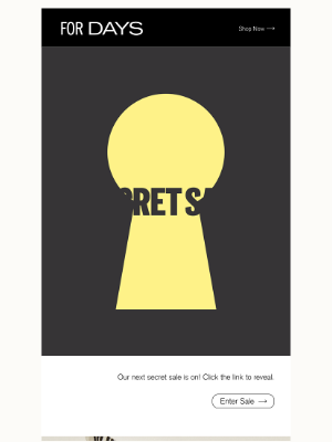
For Days uses a clever through-the-keyhole animation that grabs and holds attention. But that’s not all! The copy promotes a unique discount and a surprise brand featured in the sale.
Sign up free for 502 curated examples
Use the rule of 100 to help determine or test copy
The psychology of pricing can help you choose the right copy for your sales email. The rule says, in essence, that items costing less than $100 will look like better bargains if the offer is shown as a percentage discount instead of a lower price. For items over $100, a dollar-amount discount can be more impressive. But sometimes you can use both.
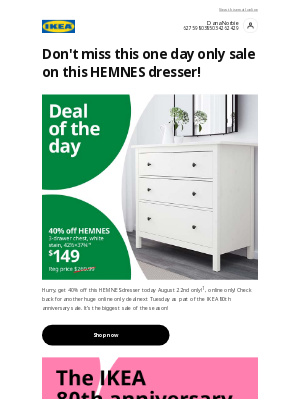
IKEA lists the Deal of the Day at 40 percent off, but the item’s discount price of $149 is more eye-catching. This is another psychological maneuver called anchoring, which says people use the first piece of information they learn as a yardstick to measure value. Here, the $149 price stands out not just because the type is larger but also because it looks good when paired with the much higher original price.
Focus on providing inspiration
Some customers are always in the market for new products. Others need a little inspiration, especially for how to use the advertised products.
Scrapbook‘s email shows a rotating collection of cards made with the products being sold throughout its long digital circular. It can be enough to persuade a scrapbooker who already has boxes full of stamps, inking pads, and add-on doodads that yes, indeed, she really does need just a few more as long as they’re on sale.
Sign up free for 502 curated examples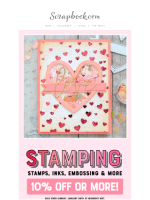
Send more than one email
Is one email advertising a big sale ever enough? We say no because you know not every subscriber reads or even sees every email you send. But that doesn’t mean you should swamp their inboxes with an email barrage.
Sweaty Betty (U.S.) doubled its frequency during its four-day Labor Day sale. It sent an early-morning sale promo along with its regular daily new-product email, sent early in the afternoon.
The two sets of emails also look different, with different colored backgrounds and subject line styles. But before launching this tactic, test it to be sure your subscribers will tolerate the higher frequency, even if it’s temporary.
Remind the customer that it’s time to reorder
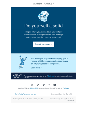
This can be one way to increase sales without discounts or incentives. An email like this is more of a lifecycle message that should be timed to trigger when customers are likely to be running out of your product, like the contact lenses Warby Parker promotes in this email.
Warby Parker’s email has three other things going for it:
-
The subject line promotes the benefit of restocking: “Restock and rest easy”
-
It upsells customers on its annual purchase program, framing the savings as a way to buy another Warby Parker product.
-
It also lets glasses-only customers opt out of contact lens emails, which is another data point the brand can use to learn about its buyers and a one-click way to update content preferences.
Simplify the purchase process
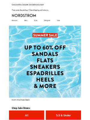
Taking barriers out of the purchase process can begin right in your email. Give customers buttons, like Nordstrom‘s brightly colored buttons, which they can use to go to the right products without using filters to sift out irrelevant choices.
This can benefit readers viewing your email on any device, but it’s extra-helpful to mobile users so they don’t have to peer at a small screen to use your landing-page filters.
Sign up free for 502 curated examples
Mention the discount in the subject line
When you have a hot sale, it’s no time to be subtle in the subject line. Meal subscription service EveryPlate pulls out the stops with this inbox entry: “Delicious deal alert 🚨 $1.39/meal!”
The low price per meal helps the sale stand out from all the emails with percentage discounts and also uses the anchoring principle we mentioned above to set the customer’s expectation for value.
Sign up free for 502 curated examples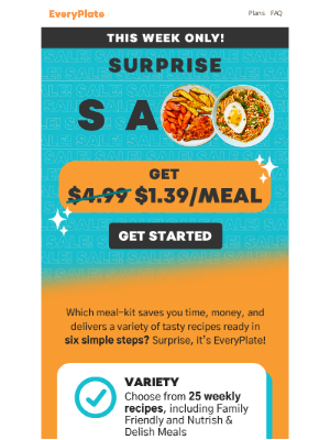
Use customer photos
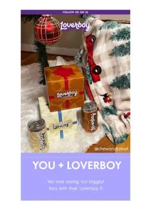
Your brand photography looks marvelous. But customers might be even more moved to see how people like them are using your products.
Loverboy regularly features photos of customers enjoying the brand’s canned hard beverages and its branded merch. Its husband-and-wife leadership team, Kyle and Amanda Cooke, also show up regularly in promotional emails. This is also an excellent way to invite customers to join your brand on its social channels.
Include gift guides
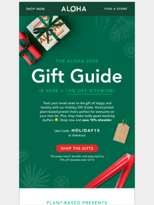
When you want to offer a discount or incentive, use a gift guide because you can structure your suggestions to give customers ideas on how to use their promotion. MailCharts subscribers will find dozens of ideas for gift guides tied to holidays, recipient personas, and other categories. This email from Aloha shows how the format can work even for brands that don’t fit the classic ecommerce business model.
Tip: MailCharts subscribers can review nearly 300 gift guides from brands like lululemon, YETI, and ABC Carpet & Home in our hand-curated Gift Guides list of email examples.
Welcome new subscribers with a discount
Your welcome/onboarding journey is more than a chance to say “Howdy.” If your brand uses a discount or incentive to entice site visitors to opt in to your email program, your welcome email is the perfect place to deliver it. This email or series should be designed to nudge your newcomer to browse and possibly even buy, and to start creating data points you can use to target future messaging.
Jomashop gets right to the point with an email that restates the benefits of signing up for email, tells the customer how to use it, and suggests possible purchases or destinations to move shoppers right back to the website.
Sign up free for 502 curated examples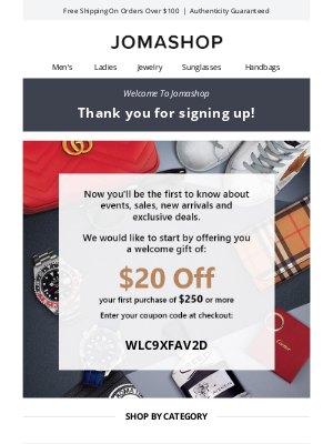
Organize seasonal promotions
There’s a reason why many email marketers start working on their holiday messages when summer is still baking the sidewalks outside—finding ways to make their emails stand out is a full-time job by itself.
One stand-out idea: using a promotional email to invite customers to a virtual treasure hunt throughout the website, like this message from Catherine’s. One caveat: This email is not optimized for mobile, but it easily could be if the brand had highlighted only the treasure hunt.

Help customers buy
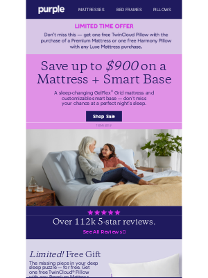
It’s not enough to sell your customers a product. You should use every opportunity to help your customers buy the right product. It works for everybody—your customers are happy, so they’ll come back again. Your customer service people are happy because they’ll have to deal with fewer returns.
This email from Purple gives shoppers many avenues to get advice, from customer reviews to buyer assurance policies and links to online assistance.
Highlight product launches and new arrivals
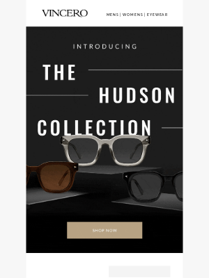
How can you sell without selling? By creating excitement about new products and collections.
This email from Vincero makes a big event out of introducing new sunglasses with an animation that slowly reveals each new model. That builds anticipation for the mobile-friendly images and descriptive copy that follow. The subject line is just as low-key exciting: “New Collection Alert.”
Tip: Brands know email is a perfect vehicle for introducing new products and collections. That’s why MailCharts has a curated and searchable collection of 200+ emails full of newness. We unlock the Introducing New Collections list at least once a year so all subscribers can use it. Free subscribers, check your email homepages and your update emails regularly to learn when the list is available.
Offer subscriber-only specials
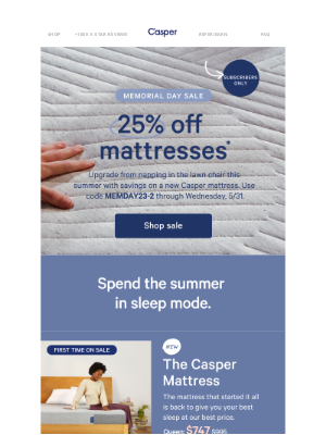
Customers sign up for email to get VIP treatment, whether that means discounts, early notices of sales, or other subscriber-only perks. So these messages should be prominent in your email schedule.
Casper reminds its subscribers about their special deals by posting a “subscribers only” badge in those campaigns. It’s a subtle but noticeable reminder that Casper is delivering on its opt-in promise.
Don't forget your customers' birthdays
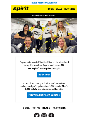
Birthdays are the perfect moments to send your email subscribers a discount or other special offers so they can treat themselves by buying from you.
Follow Spirit Airlines’ lead: Use the recipient’s first name, time the message as close to the birthday as possible, and send a relevant incentive (one that won’t take a big bite out of your profit margin).
That turns your message from just another email into a digital birthday card.
Use an easy-to-remember coupon code
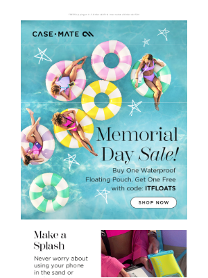
Along with helping your customers to buy the right products the first time, you’ll remove another barrier to checkout when you give them a memorable discount code.
The code in Case-Mate’s email, “ITFLOATS,” is genius. It’s short, it’s easy to type on a mobile screen, and it repeats the benefit of the product the brand is promoting in the email.
A coupon code like “WXAUG2023FLT” might be a data-rich locator for your ecommerce or CRM system but it’s super-customer-unfriendly if your email doesn’t automatically fill in the discount code on the checkout page.
Write a memorable call to action
“Shop now” or (shudder) “Click here” just don’t cut it as inspirational or action-driving calls to action. The full version of this Sugarfina message is full of CTAs that tell customers why they should click or what will happen when they do click or tap on the CTA. But we really like the first button copy: “Find Your Candy.”
It fits perfectly with the astrological calendar that makes up the email’s animated hero image. Plus, using “your” makes the email more personal even though it doesn’t have any basic personalization tactics.
Tip: Need to polish up your call-to-action skills? Read Email CTAs: Boost Conversions with Compelling Calls to Action on the MailCharts blog for advice and email examples.
Give customers a reason to believe
For some customers, a site-wide sale, a 20 percent discount, or an incentive like free shipping aren’t enough to push them into shopping.
Younger consumers want to patronize brands that reflect their worldviews or have values they can support. If your brand has a clear mission or vision along with the need to make money, make sure your emails reflect it.
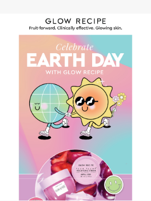
This email from Glow Recipe ran during Earth Day and makes the personal connection between a customer’s purchase and its environmental impact.
This approach has one caveat: Customers who care about the mission will be watching to see whether you consistently follow the values you talk about in your emails. For Glow Recipe, the brand adds its value statements to the end of each message.
These strategies are just the tip of the iceberg in terms of discount emails. Looking for something specific? Utilize MailCharts advanced search to discover more discount emails from similar brands and get inspiration for your email marketing strategy.

Want to explore sales and discounts emails?
Sign-up for MailCharts to discover sales and discounts campaigns and get inspired!
Discount and Promotional Email Implementation Details
Now that we’ve got our content covered, how are these promotional emails implemented? Get creative with segmentation and personalize emails when possible for that extra touch of magic✨.
Offer different discounts for different people
Keep in mind that for frequent purchasers, a discount usually doesn’t matter as much as it does to the infrequent shopper. Consider segmenting lists and discounts based on engagement with the brand. For those who haven’t placed orders in the past six months, consider a larger discount than say, shopper Suzie who buys 10 sweaters every month.
Set up A/B testing within the email service provider (ESP)
Some of the strategies suggested above require setting up pr A/B tests. Most ESPs include this feature, but it’s important to test a large enough group to get statistical significance.
Personalize with customer tokens when you can
When you collect the names of those on your email list, you can pull customer names into the email copy and subject lines to make the discount seem more personal, especially to create intrigue for mystery sales. Beyond first-name personalization, however, use integrations with other databases, such as your ecommerce or CRM platforms, to include data like loyalty program status or points, previous purchases, or location.
Craft promising subject lines (and then deliver)
There are a lot of ways you can write great ecommerce subject lines [https://www.mailcharts.com/blog/best-email-subject-lines], but all of these tactics have two things in common:
- Your subject lines need to be interesting/enticing/clear enough to make the user open the email.
- Your subject lines should promise what’s being delivered within the email.
Being able to create a click-worthy subject line is one thing. Making sure the user doesn’t then get disappointed when reading your email is another. It’s often better to make them curious and pleasantly surprise them when they open your promotional email than it is to write a sensational subject line when you’re only going to offer them free shipping for a week.
Don't forget the preview text
Oftentimes neglected, your preheader will show as the preview text in many inboxes. It could mean the difference between an open and a delete. A good preheader complements the subject line and functions on its own once the email has been opened.
Have one clear call to action
Promotional emails should always have one clear call to action. Sure, you can ask subscribers to forward your promotional email to a friend, to join your loyalty program, or to follow you on Instagram, but those are usually actions you’d like them to take in case they don’t do the main thing you want them to do: buy from you.
Optimize for Gmail annotations
Since Gmail rolled out the Promotions tab back in 2013, many email marketers have tried to convince subscribers to move their promotional emails to the inbox. Unfortunately, whether subscribers do or don’t do that isn’t something you can control.
What you can control is how your email looks when it does land in that Promotions tab.
In 2019, Gmail introduced Annotations for commercial emails [https://developers.google.com/gmail/promotab/overview]. These allow you to set and highlight your shop logo, a deal label, a discount code, an end date for your deal, and an image preview.
Done right, these annotations increase the chance that your promotional emails will be ranked as a “Top Deal” at the top of the Promotions inbox by Google. Whether they do, also depends on Google’s filtering mechanism as well as how much your subscribers engage with your promotional emails, whether Gmail considers your brand a trusted sender, and your overall inbox placement performance.
Find more discount email examples
Browse MailCharts email campaigns by industry or brands to inspire your next sales or discount promotion campaign or to begin planning your next email calendar. Not a MailCharts subscriber yet? Sign up for free!

Want to explore sales and discounts emails?
Sign-up for MailCharts to discover sales and discounts campaigns and get inspired!
