Welcome emails drive 320% more revenue than any other promotion-related emails. Regardless of your industry, you’re probably familiar with your brand’s existing welcome email strategy or have created one yourself. However, given that these emails are usually automated, they can sometimes be neglected.
If you haven’t updated your welcome emails in a while, it’s time for a refresh! This is an especially good idea if your brand has recently undergone a rebrand or change to messaging guidelines. If you’re looking for some inspiration, look no further. Our team of expert data analysts has compiled a few of their favorite welcome emails:
Zales
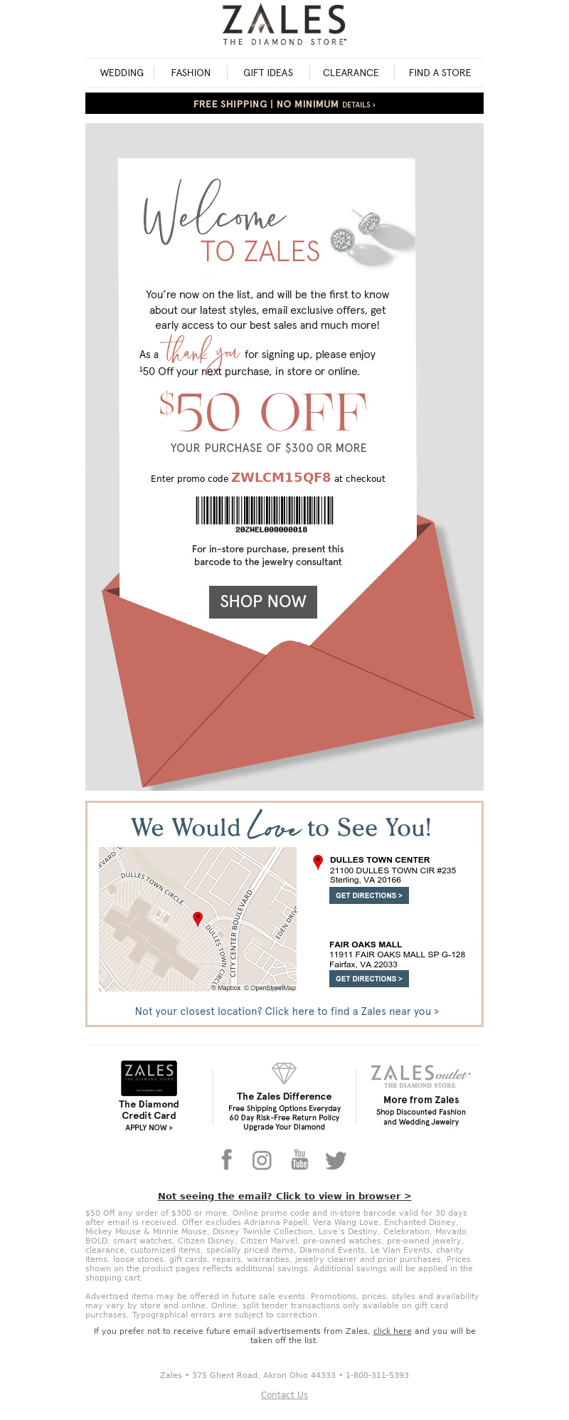
With the power of MailCharts, we’re able to see jewelry store Zales’ full welcome email journey. In their initial email, sent 10 minutes after a shopper subscribes, they promote a $50-off code that can be used online or in-store. The email also has a map that points subscribers to the nearest store location. This is a great tactic especially for those companies with brick-and-mortar locations so that shoppers can engage in person.
Welcome to Zales — Here's Your $50 Off Code!
Zales waits one day before sending a follow-up email to subscribers reminding them to use their $50-off coupon. This email offers multiple product details and customization services and keeps Zales top of mind as shoppers visit retailers.
In the first month, Zales sent 33 emails, including promotional emails and jewelry collections. When we look at the welcome journey as a whole, too many emails can be overwhelming to subscribers. For companies like Zales, this strategy might be effective, but it’s essential to test which cadence and frequency work best in your industry.
PetFlow
Pet food delivery service PetFlow takes a different approach by promoting multiple products in the first email. This uncommon strategy of promoting specific products is a nice change from the brief messages we’re used to seeing in welcome emails. PetFlow also includes a small discount with the products advertised in this email: 10% off discount for auto-shipping (5% off for one-time purchase).
Welcome to PetFlow!
Over the next week, PetFlow sends an additional three emails with the same subscriber discounts mentioned in email one.
It’s not until 11 days later that the next round of emails gets sent. We noticed with these later emails that PetFlow will test subject lines for non-openers using the same email content approximately nine hours after sending the first subject line test.
This is a great way to test subject lines for future email journeys and gives PetFlow a sense of the best time of day for reaching out to potential customers.
Cure
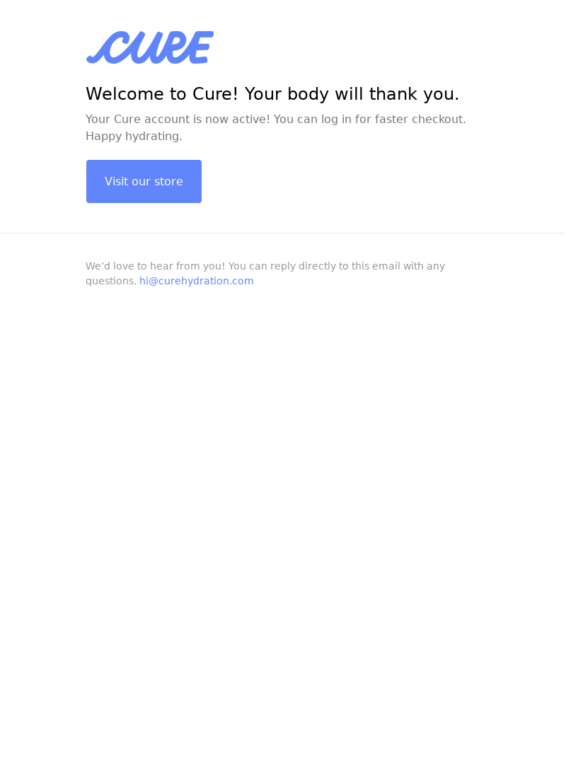
Hydration mix company Cure takes a simpler approach to their welcome email design. Instead of inserting an overwhelming number of images in their welcome email, they opt for a few lines of text and a clear CTA to visit their store.
Hello, hydration! Welcome to Cure 👋🏽
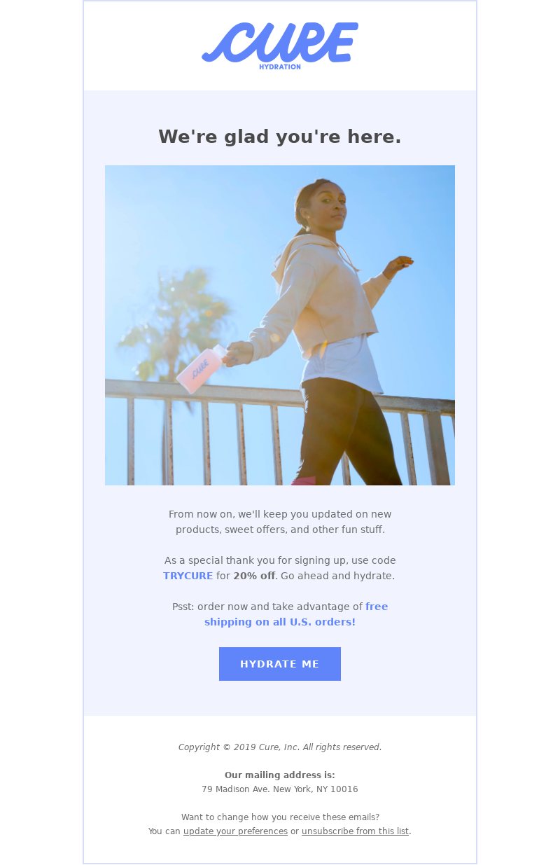
The second email is sent within seconds of the first email (both within 15 minutes of opt-in) and includes a generous 20% off coupon to try the product. We love email two because it keeps things simple with one image and a catchy CTA: “HYDRATE ME”.
Welcome to our hydration lair.
Among the three companies mentioned here, Cure sends the fewest emails in the first month after signup (seven). Your brand needs to keep subscribers engaged but not annoyed by the number of emails they’re getting from your company.
Searching for more inspiration? Take a look at our freshly curated welcome emails, along with several campaign and implementation strategies to get you started.
Editorial Image by Pezibear from Pixabay
