Even though transactional emails see 8x more opens and clicks than any other type of email — and can generate 6x more revenue — it’s shocking to see how many companies fall short. In our unboxing blog series we take a look at the transactional emails of the biggest and most popular retailers. Join us to see what’s working, what’s not, and apply these learnings to your own transactional emails.
Spending Time with Dollar Shave Club
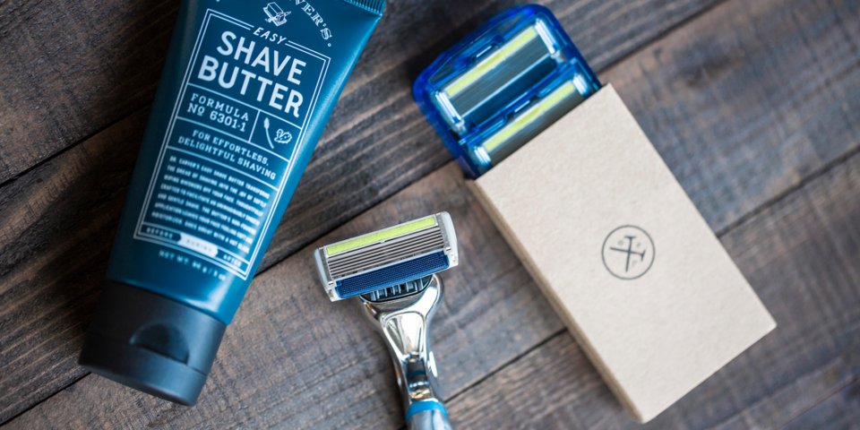
Dollar Shave Club is a service that delivers razors and other grooming products to customers in North America, the UK, and Australia. Unlike other subscription services we’ve studied, like BarkBox, which only come once a month, Dollar Shave Club allows users to customize delivery schedules based on their shaving needs, which is pretty smart.
The company was founded in 2011 by Mark Levine and Michael Dubin, who met at a party where they shared their common frustration over razor costs. By 2016, DSC was acquired by Unilever for $1 billion.
Dollar Shave Club clearly puts a lot of thought into their design and branding. To visually communicate with their target audience, DSC primarily uses masculine neutrals in their color schemes. A quick look at their Pinterest boards, display ads and marketing emails shows a lot of browns, tans and oranges.

While the company has made a few fledgling attempts to expand to a female demographic in the past, Dollar Shave Club is all about dudes. Their blog is filled with GQ-like content on topics ranging from fashion tips to locker room etiquette to sex advice. Their social feeds are filled with beard memes and clickbait articles on weird topics like nipple removal. Bottom line, DSC knows its audience and how to turn those clicks into conversions.
Dollar Shave Club’s Purchase Experience
We know what DSC is about when it comes to marketing, but do their transactional emails sync up? Let’s take a look.
The MailCharts data team purchased a three-piece starter set for $5 plus tax with free shipping. From the time of purchase through the first 30 days, Dollar Shave Club sent us 21 emails, which is a fairly average number compared to other retailers we’ve examined in our unboxing series.
We’ll take a closer look at three of those emails here, but to see all the emails sent to a purchaser, as well as the sign-up abandoner user flow, sign up for MailCharts.
The Order Confirmation

This is the first email we got from Dollar Shave Club after ordering our starter set. Given that this is the first email, one piece of feedback is to add the company name to the header — users might not immediately recognize their logo.
Below the header there’s a CTA to add items to our order. By using the 60 minute time limit, DSC creates a sense of urgency, which is smart. One thing DSC could have done better, however, is suggesting specific products rather than just a general call to shop. This addition could help increase their average order value.
From there we have our order summary. One nitpicky piece of feedback here is that the image on the left features five products, when the set we actually ordered only contains three. This is a small inconsistency, but could be misleading. Our summary also lets us know that shipping and handling were free, which we love seeing as online shoppers. DSC also includes the last four digits of the card number that we used — which we love to see as well.
Below that, the email tells us that we have zero Club Credits, which is confusing because at this point we don’t know what those are. Are Club Credits like points you earn as you shop or are they an actual discount? Immediately below that, there’s a callout that explains the program. One idea is to consider re-ordering the placement of these two sections — or possibly combining the two for clarity.
From there, DSC promotes original content, which is not something we’ve seen a ton of in this series (however REI did a nice job of it with their “Learn with REI” email). This is a smart idea for retailers since it provides an alternate action users can take other than shop more or refer a friend.
Our last piece of feedback is that DSC doesn’t do much to answer FAQs or fill us in on what emails we’ll be receiving in the future. The only support callout in the email is buried in gray in the footer, so we’d recommend making that more prominent.
The next email we’ll look at came 10 days later.
A Strategically Smart Product Promotion

Skipping over our first shipping notification email, we’re now going to take a look at a follow-up email from Dollar Shave Club. This promotion for a trial kit of products is aimed at customer retention and is doing a lot of things well.
First off, the product offering and pricing strategy is smart. They offer three of their most popular products in trial sizes and only charge $5 for it. If this were a $50 kit, we probably wouldn’t give this email any attention, but $5 is super manageable and trial sizes are low-commitment. From there, they offer brief reviews in a clean layout.
Although the order confirmation email lacked product recommendations, DSC clearly knows how to execute them as we’ve seen here.
Five days later, we get an email asking us to leave a review.
DSC Nails the Review Email

A quick gush: This is one of the best review solicitation emails we’ve ever received (and we’ve purchased from thousand of companies!). It’s clean, simple, visually attractive and uses funny, on-brand copy. The color scheme is simple and the orange “write a review” CTA stands out without overstating. A+
The final email we’ll look at came 13 days later.
An Unclear Subscription Process

Two days before our next package of razor cartridges was ready to ship, Dollar Shave Club sent us this email. Notice in the top right they’ve got a nice little cart indicator. The copy lets us know when our item will ship and gives us a chance to add things to the order in a very well executed upsell. DSC outlines eight products and includes a CTA to view all other products.
One overall critique for Dollar Shave Club’s transactional emails is that the subscription process is not clearly outlined. The confirmation email is a bit ambiguous at explaining how much we’ll be paying when.

Now, we have a shipping notification with recommended products at the top of the visual hierarchy and our order summary info buried near the footer. One could easily assume at first glance that this was just another product promotion and miss those crucial billing details. Also, how much are we going to be billed for this next box? Totally unclear.
At the very least, this email should make it easy for customers to know how much they’ll be charged. Brownie point if they allow us to manage / cancel our subscriptions here too. Having a vague subscription process and not outlining cancellation steps can be a slippery slope resulting in loss of customer trust.
Dollar Shave Club’s Unboxing Experience

Dollar Shave Club wins at clever, simple copy again.


As we already know from checking out their blog, DSC is doing a great job with content and it’s obvious from their unboxing experience, too.

The kit also included some interesting science content. This reminds us of a grown-up version of what we used to read on the back of the cereal box as kids!
Dollar Shave Club is clearly doing a great job with on the email front with consistent branding and great product recommendation. Our main feedback would be to be more explicit about the subscription renewal cost.
To see more data on Dollar Shave Club’s email strategies as well as data from 30,000+ other companies, join MailCharts today!


