Even though transactional emails see 8x more opens and clicks than any other type of email — and can generate 6x more revenue — it’s shocking to see how many companies fall short. In our unboxing blog series we take a look at the transactional emails of the biggest and most popular retailers. Join us to see what’s working, what’s not, and apply these learnings to your own transactional emails.
A Closer Look at Dillard’s
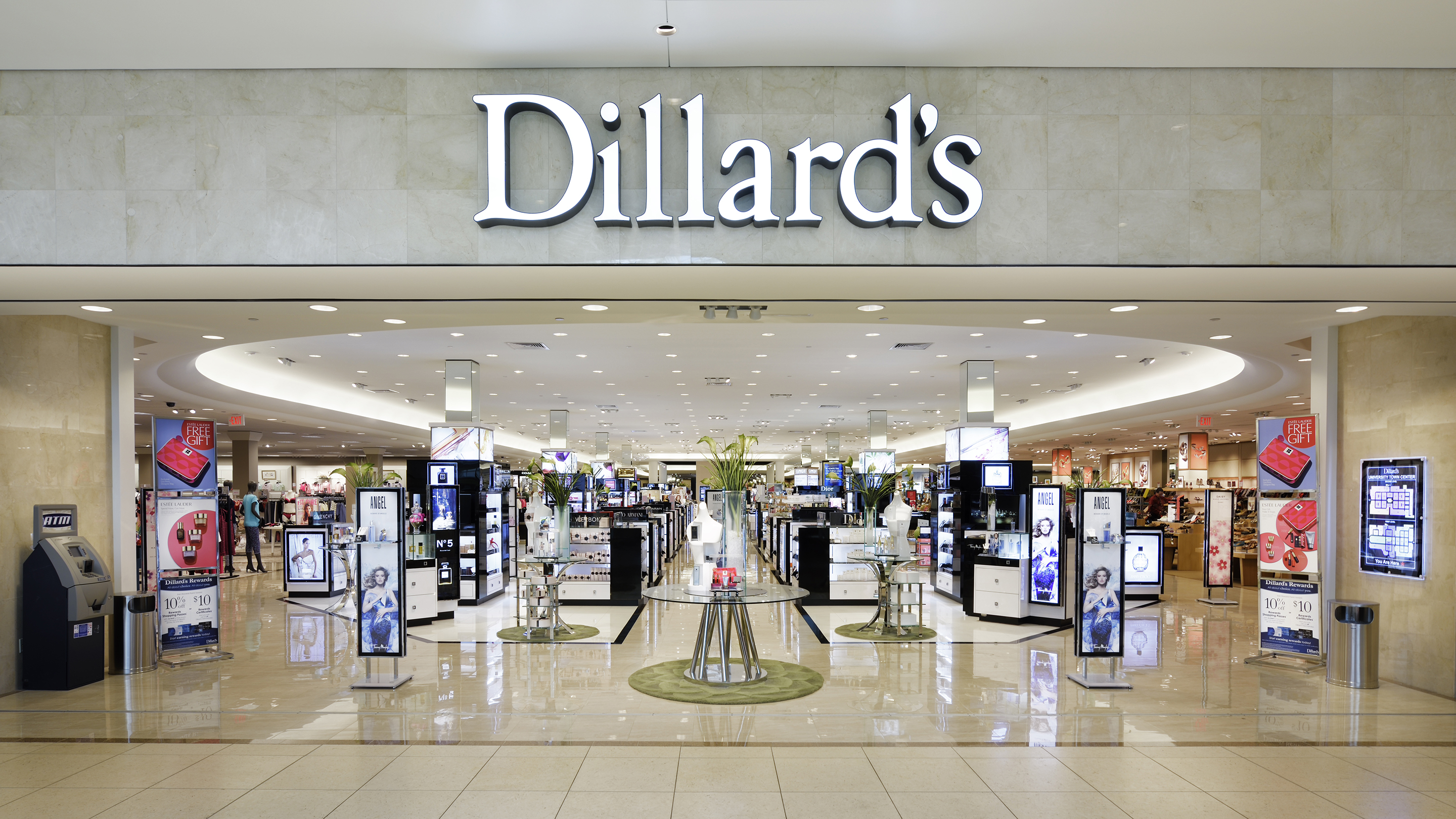
Dillard’s is a department store chain founded in 1938 and is headquartered in Little Rock, Ark. Unlike most national retailers, Dillard’s remains focused on family. In fact, many of its executives and directors are members of the Dillard’s family. In addition to about 330 brick-and-mortar stores, the company also owns the ecommerce site Dillards.com.
Unlike Target, who uses the telltale red to market their brand, Dillard’s doesn’t use a common branding theme, which can make their marketing efforts feel a bit disjointed. Instead, Dillard’s chooses to focus each ad, social post, and email around the product and model.
Focusing on the product is not generally a problem, (Barkbox and Sephora do this really well), but with plain backgrounds in their images and busy copy in their ads, Dillard’s struggles to evoke the right feelings.
In most cases, Dillard’s tries to push the luxury aspect of their products by using aspirational imagery and taglines like “The Style of Your Life,” and “The Style of Christmas.” Take a look at some examples below.

The Dillard’s Purchase Experience
Do the Dillard’s transactional emails communicate a cohesive message? Are they on-brand? The MailCharts data team tested these questions by purchasing a pair of socks for $5.00 plus shipping.
Today we’ll unbox the product along with the email purchase experience. From the time of purchase through the first 30 days, Dillard’s sent us 24 emails, which is exactly how many Chico’s sent in that same period.
To check out more emails from Dillard’s, such as the cart abandoner user flow, sign up for MailCharts.
Let’s take a deeper look at Dillard’s purchase email experience, starting with the order confirmation email.
The Order Confirmation

Dillard’s order confirmation email is fairly plain. This simple black and white does do a good job, though, of making the blue Order Status CTA stand out.
All of our order information is there including the product photo and item size (yay!). One thing that’s missing is the type of credit card we used and last four digits of the card.
We also find it interesting that Dillard’s puts their customer service phone number in the header as well as the support callout below the order information. One improvement we might suggest is to remove the phone number from the header to clean things up a bit.
At the bottom of the email you will find a nice upsell for the Dillard’s credit card along with a handy navigational footer.
Next we’ll skip over the shipping notification and look at the delivery notification email, which we received five days later.
A Multipurpose Delivery Notification

As we have seen in our unboxing blog series, delivery notification emails are fairly uncommon amongst etailers. Kudos to Dillard’s on this. This is also a great email because they are providing information about our delivery, as well as encouraging us to act by sharing feedback on the purchasing experience.
One not-so-great element about this email is that it only gives us our tracking number and does not reiterate what was delivered (i.e. the product). This may not seem like a big deal, but if we placed an order that was broken into several shipments, this experience could become a bit confusing.
The “Leave a Review” Email

Eleven days later, Dillard’s sends us this email asking us to review the order.
We like the lead-in copy (“Love it, Hate it, Rate it!”) that encourages us to leave a review. The fact that you can begin your review two ways – by clicking a star or clicking the blue “Write a Review” CTA – reduces friction which is great.
We also love how consistent Dillard’s has been in each of these emails with their headers, footers and low-key design. Nice work!
The Dillard’s Unboxing Experience

Dillard’s does an excellent job of branding their delivery packaging. It’s not terribly decorative, but there can be no mistakes made about where this package is from.

Inside was our packing slip and product. Straightforward and to the point.
Final Comments
While Dillard’s may benefit from unifying their marketing messaging, it’s clear that their transactional emails are hitting the mark. We loved their consistent designs, CTAs, and upsells, as well as the inclusion of a delivery notification. In the age of Amazon, it’s nice to see that other retailers are providing a user-friendly purchase email experience.
To see more emails from this purchase experience and to find detailed email insights from 30,000+ other companies, join MailCharts today!
P.S. We purchased from Dillard’s again recently and their transactional strategy just changed — log into your MailCharts account to see the new flow.


