If a picture is worth a thousand words, an animated GIF is worth … more clicks? Animation in an email message can add interest and excitement, help you display or demonstrate products more effectively, focus attention on your call to action, and keep and hold subscribers’ attention.
Animation takes two forms—an animated GIF (Graphic Interchange Format), which is two or more still images stitched together to create a short-form moving image, or video—essentially a long-form animated GIF running at a higher frames-per-second rate.
We’re focusing on animated GIFs in this post because they’re easier to create and operate more reliably on more platforms, in SMS as well as email.
Here at MailCharts, we see more brands using animation maker online in new and clever ways to add oomph to their messages. But effective animation requires more than a cute GIF. Read on to discover fresh takes about when, where, why, and how to use animation to make your email and text campaigns capture interest and drive conversions.
1. Need ideas? We have dozens!
Animated GIFs come in all shapes and sizes, from subtle shadings to eye-catching hero images. We update our hand-curated Animated GIF email example list all the time with fresh designs to spur your creativity.
MailCharts users can scroll through almost 300 email examples from brands across the ecommerce spectrum. Or, start with this one from MeUndies, which is always doing something innovative with animation.
2. Enhance but don’t overwhelm
Go big or go home? That’s not necessarily so with animation. It’s easy to step over the line from animated to annoying. Your animations should have a purpose, like the image series in this Wantable email that looks like a classic unboxing video. Feel free to use an animation maker to save your resources.
3. Should you use animated images or photos?
Photos rule when you’re introducing new products or demonstrating how to use them. If your campaign is more about brand-building than sales, an animated image could tell the story better. Or, as with this Oakley campaign, you can use both for more impact!
4. Test to find a lift
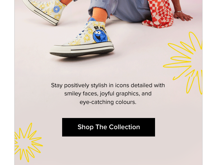
Testing is essential to learn whether animations are more or less likely to drive customer actions. One factor to test: Is animation farther down in the email, as in this Chucks campaign, as effective as a top-line animated GIF?
5. Animate your transactional emails too
But keep them relevant to avoid distracting customers from your message’s intent. We love the dual animations in this abandoned-cart email from Poo-Pourri—the animated logo as well as the product image, which draws the eye right to the CTA button.
We hope these examples have inspired you to start elevating your emails with great animated content. As a MailCharts user, you can start researching animations from popular brands, see what your competition is doing, and get even more ideas for making your messages come to life.
Join for free and get started right away. Already a MailCharts user? Upgrade to Pro and get immediate access to our full database of brands, insights, emails, and data!


