It’s not always easy coming up with new ideas for your email campaigns. Luckily, you don’t need to design every email from scratch. Once you’ve figured out what type of copy, visual elements, and strategies your audience reacts well to, you can create a few ecommerce email templates. These will form the basis of new emails and evolve as you run more tests.
Even when you don’t have a lot of data on your email marketing performance yet, you can create the first version of an ecommerce email template for each type of campaign you run and tweak it as you get to know your subscribers better.
To offer you some inspiration, we’ve gathered some great email examples from top ecommerce brands below. We’ve categorized them by campaign type:
- Account confirmation
- Welcome email
- Cart abandoner
- Browse abandoner
- Order confirmation
- Shipping confirmation
- Subscription cancellation
- Leave-a-review
16 Email Template Examples for Ecommerce
Account Confirmation Templates
These templates are often short, sweet, and to the point to help verify account creation. Usually, the primary CTA is to confirm your email address or account. Here are a few of our favorite account confirmation emails:
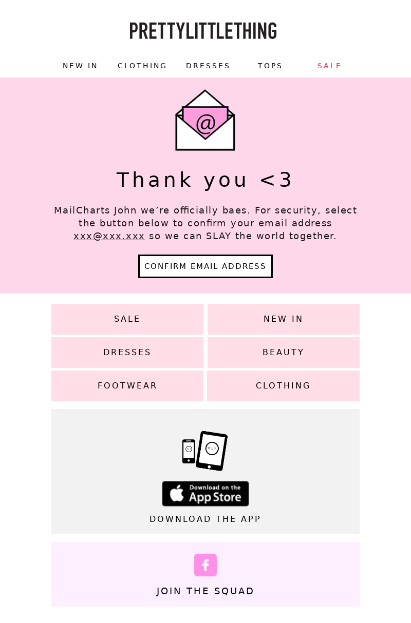
Clothing retailer PrettyLittleThing does a great job making the often-boring confirmation email fun with an animated envelope and casual, fun language. It also includes clear links to popular product categories so new subscribers can immediately start to shop. Two additional animations draw attention to the CTA to download PrettyLittlyThing’s app and to follow the brand on social media. This is a great tactic as it brings new subscribers back to engage with the brand.
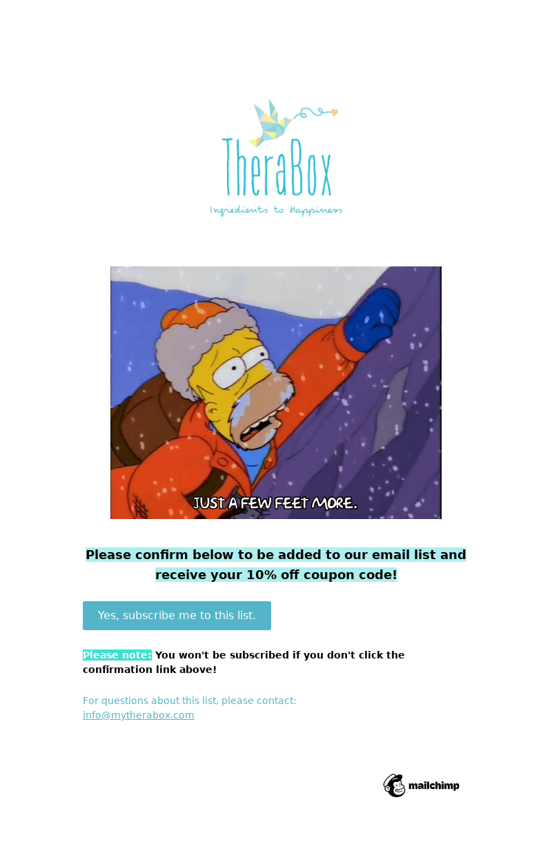
TheraBox adds humor by including a Homer Simpson GIF to their account creation email. They also offer new subscribers a 10% off coupon code once users have confirmed their subscription. The email template itself is simple, but that simplicity is key because if people do not confirm, they will not receive communication via email again.
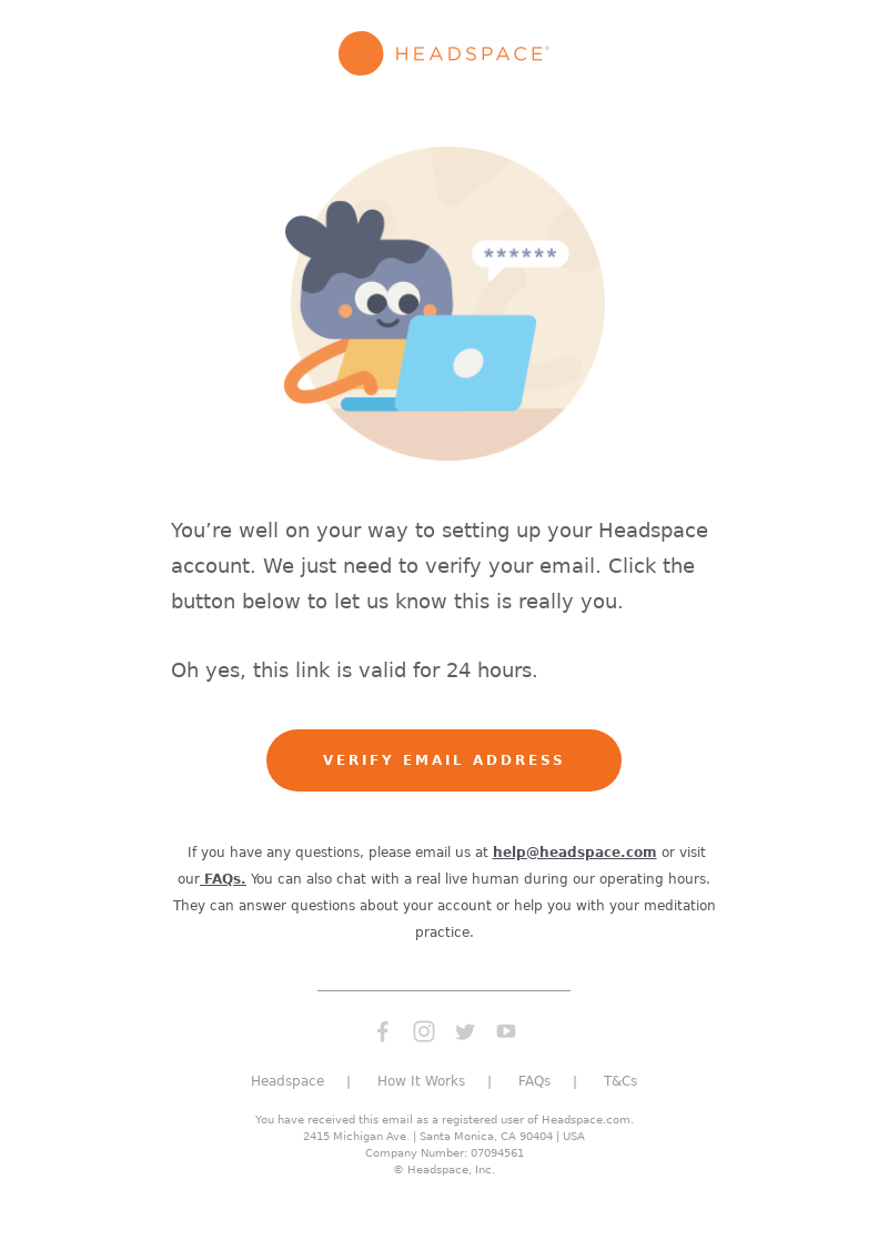
Meditation app Headspace adds a sense of urgency to its confirmation email by stating that the link is only valid for 24 hours. This email includes on-brand imagery and colors which pop against the white background. We like that Headspace includes a note for new subscribers to reach out to their team or their FAQs page should they have any questions.
Welcome Email Templates
Welcome emails are typically not used to hard sell new subscribers on products. Instead, welcome emails or welcome series generally educate new shoppers on the brand and offerings. They’ll sometimes include a small promotional discount for new shoppers, too!
In Rhone’s welcome email they provide details about the activewear brand. This includes the mission and background of the brand while strengthening the brand’s positioning. Next, they have a call to action to join Rhone’s rewards program, accompanied by an explanation of the program’s benefits. Lastly, they feature their best-selling products using beautiful imagery. We love that this email focuses on the brand mission and rewards program before getting to the products. It strikes the perfect balance!
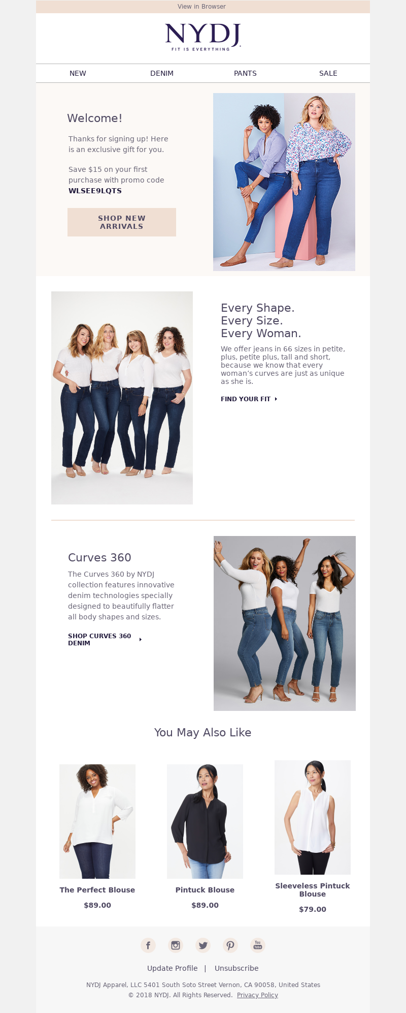
New NYDJ subscribers are rewarded with a $15 discount in the first email. The main CTA to shop now stands out against the other links in the email and is highlighted in the top section. The rest of the email primarily focuses on their denim and not their other apparel products (until the end of their email where they include a few shirts). This email is more product-heavy than some of the other welcome emails, but given they’re offering a discount, the product focus fits well.
Cart abandoner templates
These emails are generally simple templates, much like those for account confirmation. As a rule they dynamically pull in the image of the product that was left behind and can also pull in additional like-products that the shopper might be interested in. These typically focus on one CTA to continue checkout.
Outdoor brand Cotopaxi reminds the user that they put an item in their shopping cart and expresses urgency by mentioning that the item could sell out soon. We love that Cotopaxi offers the option to split the cost of the purchase into monthly payments as an alternative payment option. They conclude the email by adding a link to a seasonal gift guide as a way to get people back into their store. There was more information included in this cart abandoner email than we’re used to seeing for ecommerce brands.
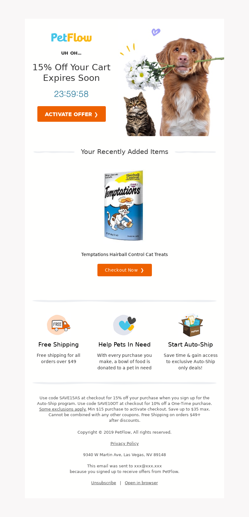
PetFlow includes a discount in their cart abandonment email to make sure the user completes the purchase. In addition to their discount, they have a countdown timer, expressing urgency to complete the purchase. Two CTA buttons make it easy for the user to retrieve the cart. We like that PetFlow also adds key benefits to shopping with PetFlow at the end of the cart abandonment email to sweeten the deal.
Browse abandoner templates
Browse abandonment emails typically have similar designs and setup to cart abandonment emails and focus on the item the shopper was browsing on site. Generally, these also include additional products because the shopper did not add the product to the cart.
Watch retailer Timex compliments the user in its subject line, making it more likely that they’ll open the email. It continues its personalized approach by listing the browsed items and recommending similar styles. The “Take another look” CTAs invite the user to come back to the website to view the product rather than push them to buy.
Fenty Beauty takes a similar approach to Cotopaxi by noting that the product a shopper was browsing might not be available soon. The beauty brand also uses its browse abandonment email as an opportunity to recommend other products, too! We love that they promote their social media to inspire shoppers on their next looks. This email concludes by promoting their SMS program and the benefits of buying from Fenty Beauty.
Order confirmation templates
These emails can be a bit bland given they’re typically just receipts and confirmation that a shopper has successfully placed an order. There’s no reason these shouldn’t carry the same look and feel as the other emails sent from the brand! Take a look at a few of our favorite order confirmation templates.
Alo Yoga uses their confirmation email to thank customers for their purchases and let them know they’ll be in touch when their yoga gear ships. The receipt also includes all relevant billing and shipping information for the customer’s records. This allows them to review their information again. We love that they include the order number in the subject line should the shopper need to reference quickly in the future.
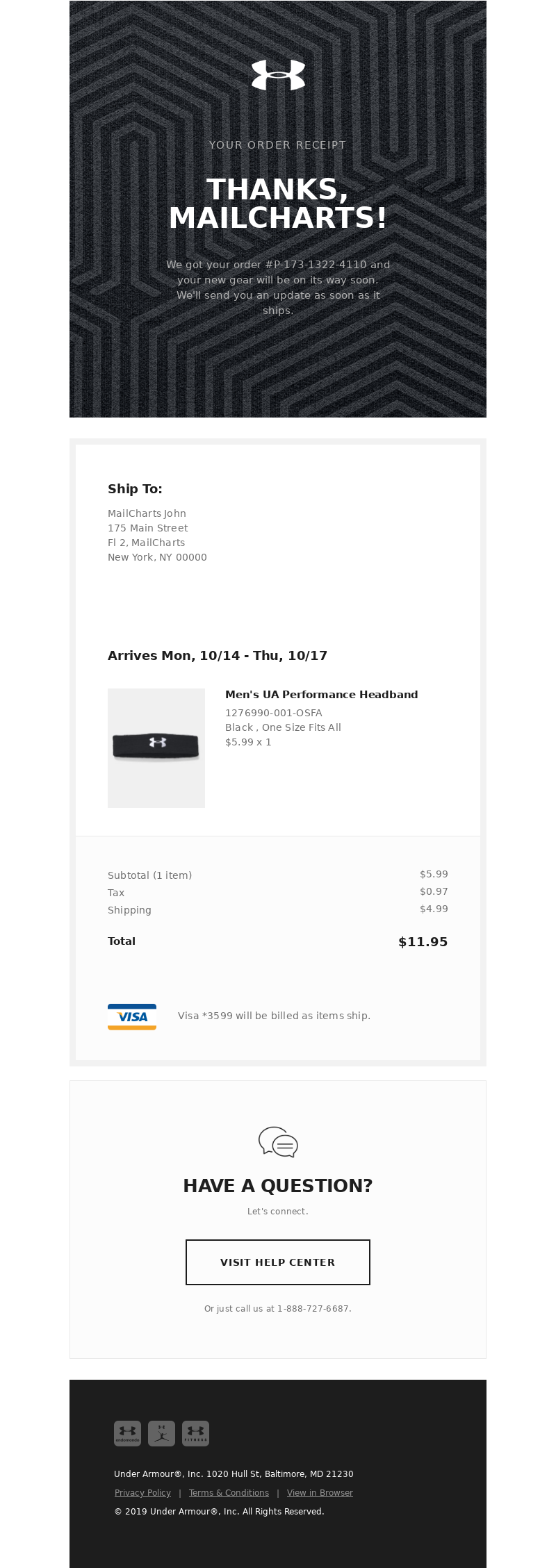
Activewear brand Under Armour has a no-frills order confirmation email in which it thanks the customer for their purchase, lists the important shipping and billing information, and offers the customer the chance to reach out to their customer service in case they have a question about their order. While this email is to the point, it does a great job of incorporating the Under Armour branding to make it look and feel like their other emails.
Shipping confirmation templates
Making shipping confirmation emails simple is key. These emails should highlight the shipping information as well as the intended delivery address. It’s important to make the email accessible and easy to skim to improve the purchase experience. A positive experience post-purchase can ultimately bring back a shopper for future purchases.
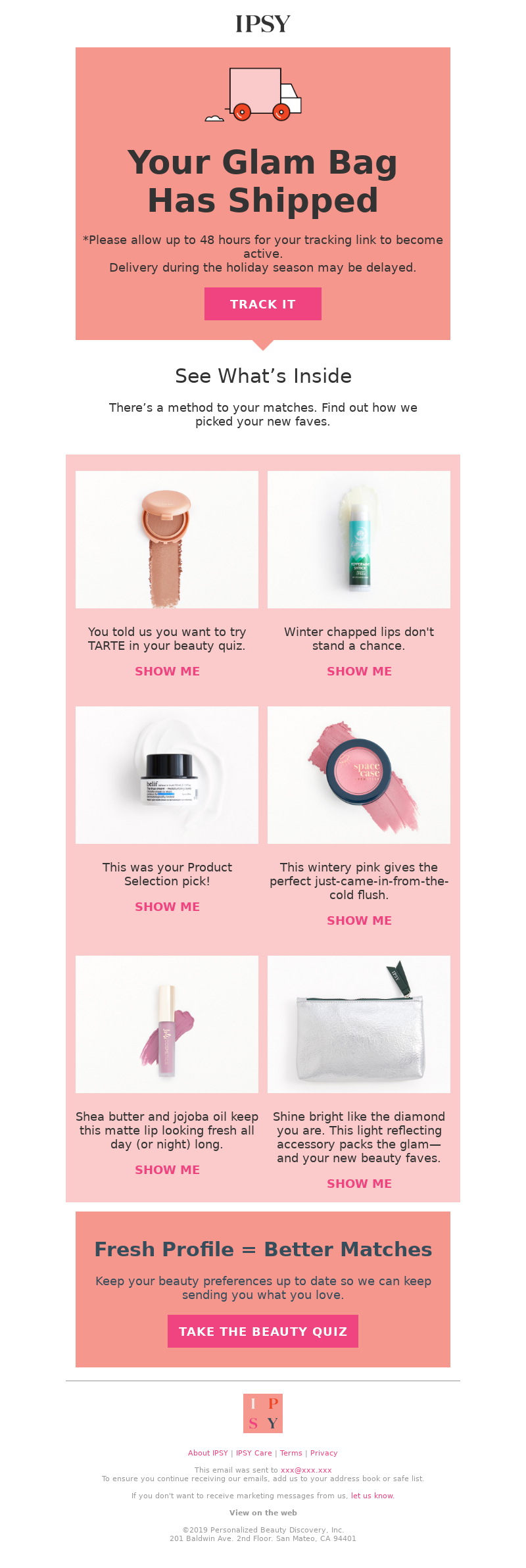
Monthly beauty subscription service Ipsy uses a fun template with an animated truck at the top of their email. The main CTA to track their order is clear and close to the top of the email for easy access should the purchaser want to check back in the email for the tracking link. Because they’re a subscription service, they include the items that will be included in their shipment along with why they’ve selected those products. Great job, Ipsy!
Outdoor brand Icebreaker keeps things on brand with an outdoor image at the top of their shipping confirmation email. In the details section of the email, it’s clear where purchasers can find their order number, shipping information, and link for tracking their package. They include a receipt in this email, too in the bottom section after outlining the pertinent shipping information.
Subscription cancellation templates
The hope is you never have to send this, but the reality for most subscription companies is that you’ll likely need a template for this type for send, too. Typically, these include a last-ditch effort to reactivate a subscriber.
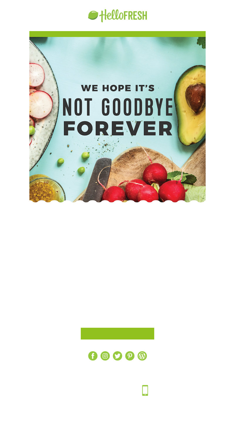
Throughout the text of their cancellation email, HelloFresh makes sure their former customer knows they’ll be missed. The main CTA of this email is for canceled subscribers to reactivate their subscription and gives them the option of pausing their subscription instead. We like that they include the final shipping date for their last box, too, so there’s no confusion from the subscriber why they’ve received another box.
Leave-a-review templates
Leave-a-review emails typically include a clear CTA for users to submit feedback on a recent purchase. These emails are typically automated and are sent a set number of days after an item has been purchased and delivered to get feedback.
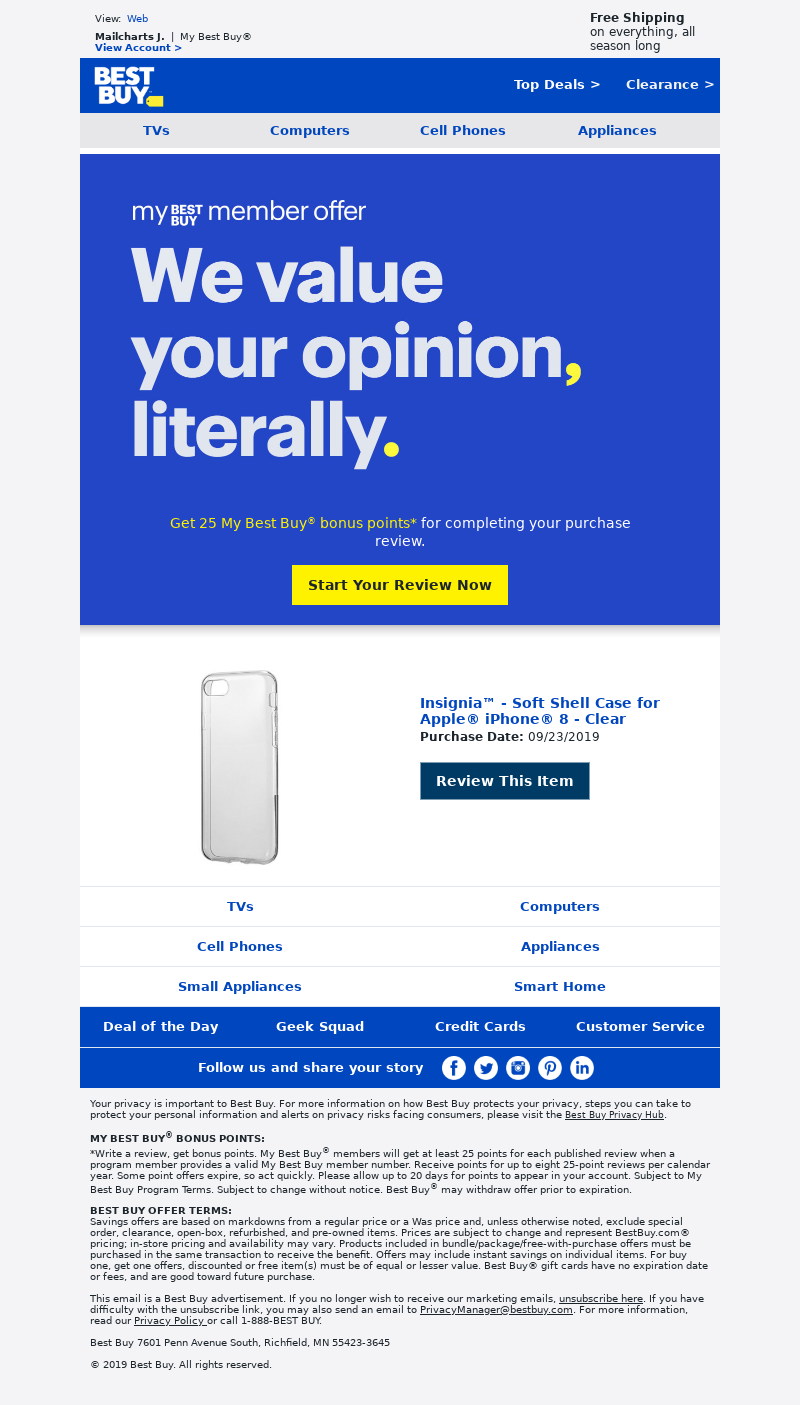
Best Buy adds an incentive to their review email as well as a clear yellow CTA pointing the purchaser to submit a review. They continue the email by including the item they purchased which is helpful if the purchaser has bought multiple items online in the past few weeks.
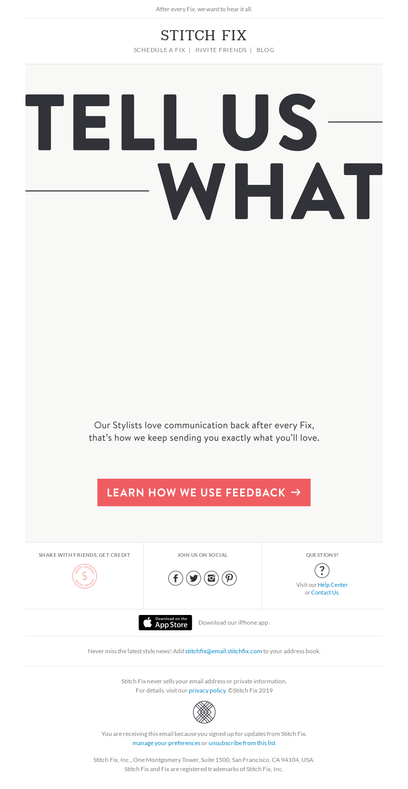
We like that Stitch Fix uses emojis in their subject line. This is a fun way to engage users and get them to open the email. The animated text in the body of the email captures the reader’s attention. They also note that this feedback helps the stylist select the best options for their customers in the future, making the review helpful for both the customer and Stitch Fix. The clear CTA and its bright color also makes the email pop.
Best practices for creating an email template
1. Make it mobile-friendly
Make sure your email templates are designed in a mobile-friendly or mobile-first way. That means they should be responsive and adapt to the size of the screen they’re being seen on, and render well across different mobile email clients.
2. Make it accessible
Your ecommerce email design should be accessible. Use proper semantic code to design them so that Assistive Technology can read them and use ARIA (Accessible Rich Internet Applications) attributes that are invisible but offer descriptive information for screen readers.
Also make sure to always include a plain text version of your template in case the HTML version doesn’t load well and add alternative text to visual elements such as images and GIFs.
It’s also best to only use emojis to support your email copy, not to replace it.
3. Test it across all major email clients
Unfortunately, a lot of the new, cool features in email like video playing and even GIFs are not supported on a large number of email clients. Before implementing new features as part of your email templates, test them in a tool like Litmus or Email on Acid to ensure they’re rendering as intended for the majority of your audience.
4. Have CTAs that pop
Regardless of what the rest of your email template looks like, your CTA should always catch the reader’s eye. You can draw attention to CTAs by creating different colored buttons, playing with font size, and limiting the number of CTAs you include in every template.
If you decide to include different CTAs in one email template – for example, one to buy a product and one to follow your store on social media – make sure to always emphasize the most important CTA.
Save time by creating ecommerce email templates
Using ecommerce email templates is a great way to make sure your messaging is consistent and you’re sending the type of emails that you know your target audience responds well to. On top of that, your templates can act as controls when A/B testing specific email elements and can should evolve over time as you improve your email marketing.
Looking for more email template examples for your specific industry? Sign up today for a MailCharts account to access emails from the top brands in ecommerce.
Editorial image by Oleg Gamulinskiy from Pixabay
