Your signup forms are working great. People are signing up! But then what? How do you make sure they actually open the emails you’ll be sending them? The answer is an engaging welcome email series.
In this article, we’ll show you how to get inspiration for your own welcome email sequence and list 12 great email examples that follow best practices to start with.
But first: what is a welcome email series?
What is a welcome email series?
A welcome email series is a sequence or series of emails that is automatically sent to a new email subscriber once they sign up for your list. These emails typically go into detail on the brand, its values and initiatives, products, and any additional benefits of purchasing (think shipping policies, worry-free return policies, etc.).
Having people subscribe to your email list is a big step in getting them to purchase, but there’s more work to be done! If you’re in ecommerce, you might be tempted to talk only to your subscribers about purchasing your product and directing them straight to adding an item to their cart. While product-specific emails are great to include in your overall email strategy, a solid welcome email sequence is also key.
Welcome email series are sometimes known as nurture sequences as they nurture a subscriber to purchase and (hopefully) become a loyal shopper.
If a brand is a subscription-based ecommerce service, the welcome emails might also be used to greet new subscribers who have yet to receive their first shipment.
Implementing a welcome series also has the potential to lift CLTV (customer lifetime value). In fact, people who are actively engaging in welcome emails spend 58% more.
Study the welcome email series of your competitiors
Whether you’re just building out your first welcome series or want to revamp an existing one, it’s not always easy to come up with new click-worthy ideas… unless you’re using MailCharts.
MailCharts tracks emails for hundreds of top ecommerce brands. On top of that, we group emails within the same sequence together in “journeys” and calculate for you how long each sequence takes to complete, and how much time is left between the sending of each email.
That means you can see exactly how other ecommerce brands – including your competitors – are sending out their welcome series.
Here’s what that looks like in our thumbnail view:

You can also choose to view the emails of a sequence on a timeline:

To look up journeys within MailCharts, log into your account and select “Journeys” from the top menu. Use the dropdown to select “All journeys” or a specific sequence type, like cart abandonment.
Alternatively, you can look up the email sequences of a specific brand by entering that brand’s name in the top menu search box and then clicking “Journeys” in the left sidebar on that brand’s page.
12 Welcome Email Series Examples
We’ve used our data to pull together 12 great welcome email series examples. While these are some of our favorites, there are hundreds more to uncover in the MailCharts app from the top ecommerce brands.
With several industries featured (apparel, accessories, home, sports/activities, etc.), you’re sure to find more examples specific to your brand. Explore 100s of welcome email examples by creating a free account with MailCharts.
For now, let’s dive into our selected examples.
Pandora
Jewelry brand Pandora sends a total of five welcome emails to new subscribers over 14 days.
In the email shown below, they attract subscribers by incorporating personalization into the subject line: “kathleen, get started on your Pandora wishlist today! 🗒.”
This email invites the reader to create a wishlist and offers the option to save their ring and bracelet sizes to their account for easy shopping.
The email also includes a 10% discount that is valid for a limited time only. We like that the primary focus of this email is on their wishlist feature and the most popular products to add.
kathleen, get started on your Pandora wish list today! 🗒
In the remaining welcome sequence emails, subscribers are reminded to use their 10% discount codes, with the last email conveying urgency by adding a deadline to the discount. Pandora also continues to use first-name personalization throughout.
Below is the third email which sends 8 days after the initial sign-up.
kathleen, find your perfect fit 💍
Lovesac
The furniture company Lovesac’s welcome sequence consists of three welcome emails.
The first email contains a welcome message, the benefits of ordering from Lovesac, and advertises the Lovesac credit card.
Hey, thanks for joining the #LovesacFamily
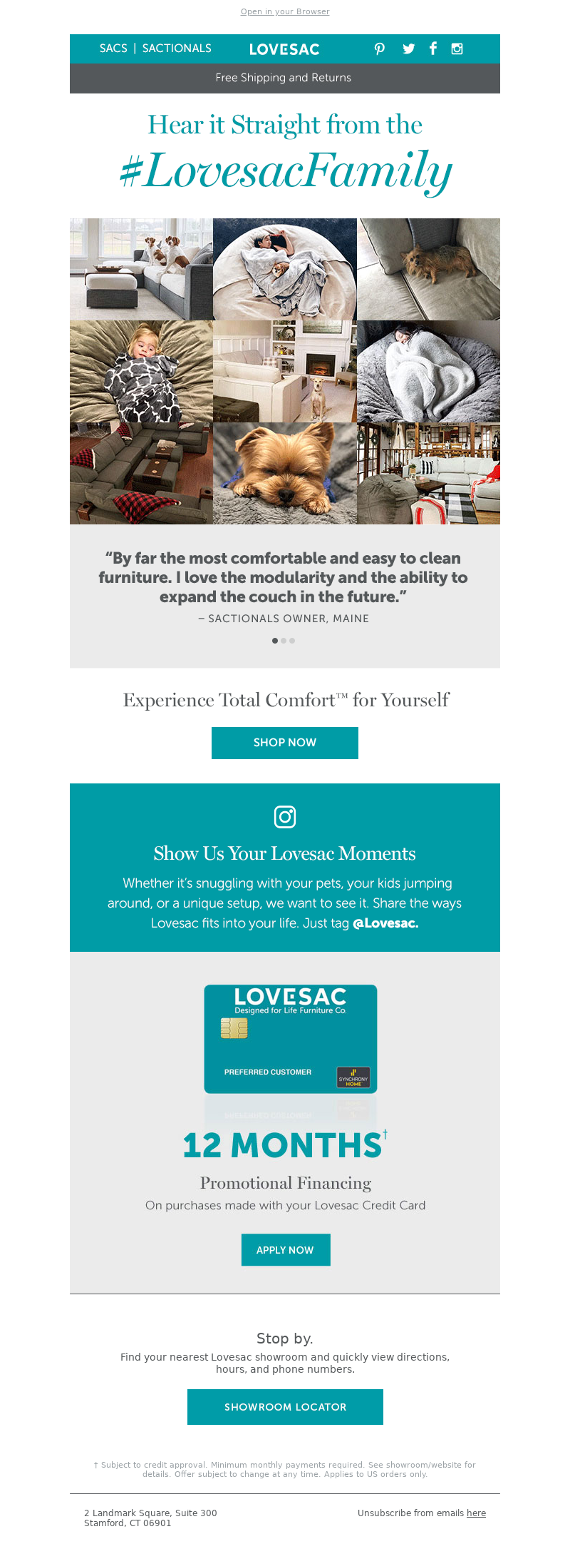
The second email in their welcome series features two of the brand’s most popular products and the third email, pictured below, highlights real customers who love their Lovesacs. It includes user reviews and testimonials while showcasing Lovesac’s products in cozy homey settings.
The #LovesacFamily said it best. Hear how Total Comfort can change your life
Rent the Runway
Rent the Runway nurtures new subscribers with a four-email welcome series.
In their first email, they keep things simple and to-the-point by welcoming the new subscriber with a fashion photo and a clear black-on-white CTA button to buy.
Welcome to the Revolution
In their second email, shown below, they advertise their Unlimited RTR program with a 50% off discount expressing urgency. The second half of the email details how the unlimited program works, including the number of pieces subscribers can select at a time, swapping styles, easy returns, and free shipping.
Exclusive welcome offer—50% off!
They continue to advertise this discount as well as reasons to choose Rent the Runway in addition to a ‘Renting 101’ video.
All of their emails include how-to video links toward the bottom of the email as well as quick links to products, the app, and testimonials.
Hulu
Unlike the other welcome emails we’ve discussed, this sequence from Hulu is for those who have already subscribed to its streaming services. As a result, its welcome sequence is primarily focused on providing helpful tips and advice on how new customers can use the subscription video-on-demand service.
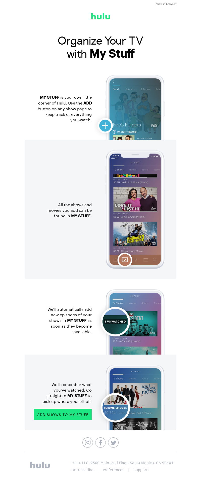
One email shares popular things to watch while another invites customers to plan their week of watching based on Hulu’s recommendations. Hulu also lets customers know they can keep track of what they’ve watched, are watching, and still want to watch in their “My Stuff” library and invites them to download the Hulu app (email five sent 7 days after subscribing).
Keep Track of Your Shows & Movies with My Stuff
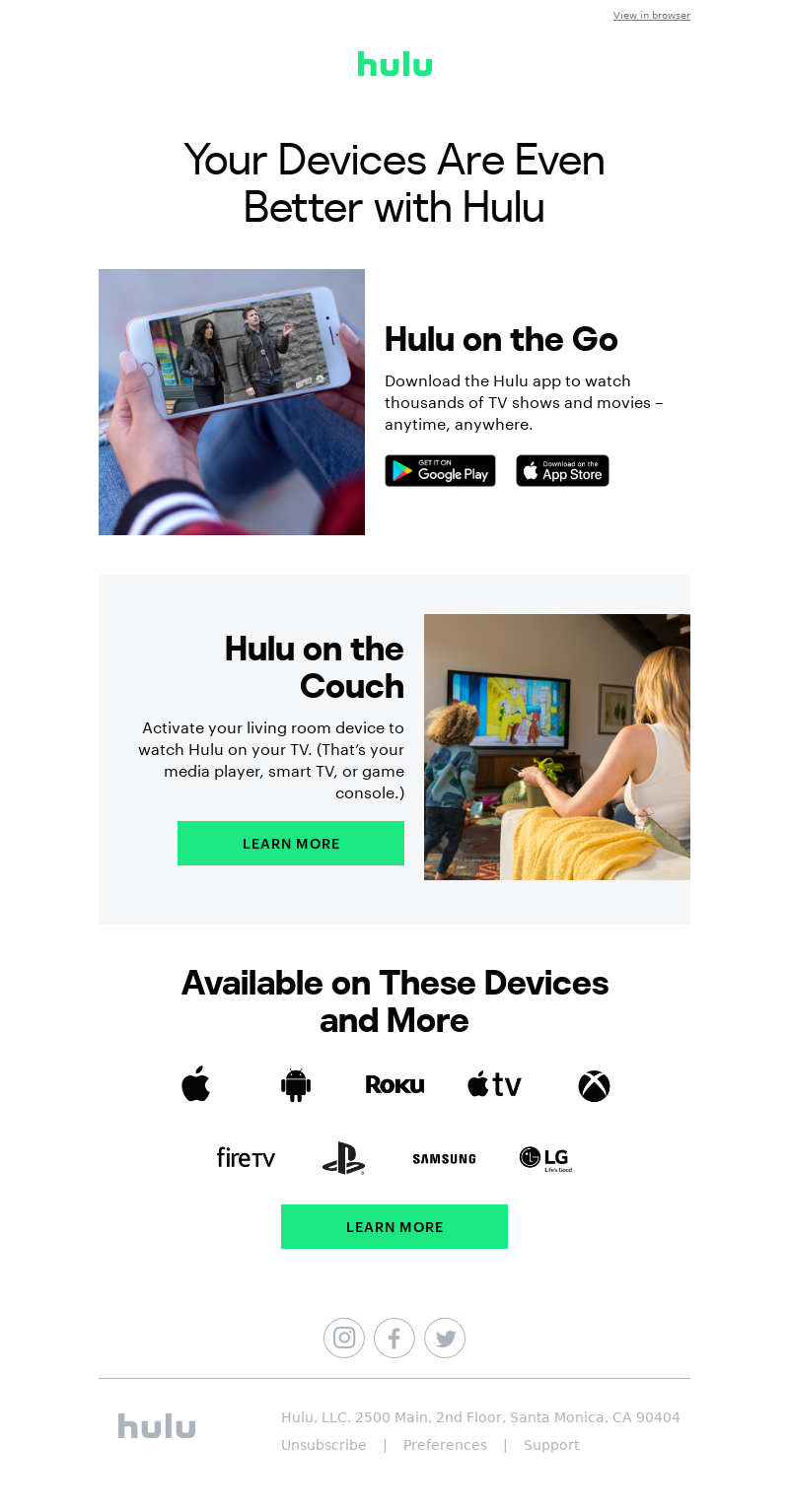
The email pictured below is the third in the series. Like the other emails, it’s short and focuses on just one thing: all the devices on which you can enjoy Hulu.
Watch Hulu on All Your Devices
TOMS
TOMS’ welcome sequence includes three emails that talk in detail about the brand’s social mission. It focuses on welcoming the new subscriber to the TOMS values and mission instead of selling its shoes.
We've got a story to tell
While the first two emails do contain call-to-action buttons linking to the online store, they don’t feel sales-y and stay focused on the TOMS brand story. It’s only in the third email that subscribers are specifically directed to sign up for the TOMS rewards program.
Want free shipping + exclusive perks?
Mack Weldon
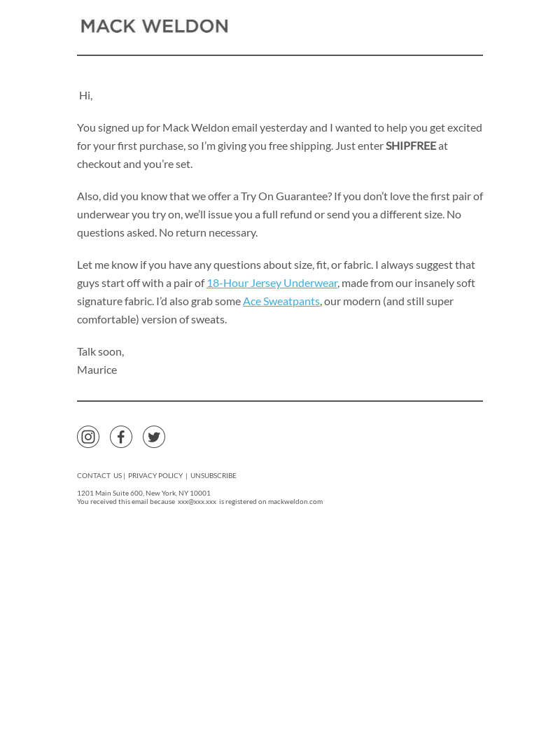
Menswear brand Mack Weldon starts its welcome email sequence with a simple text email structured in a letter format to feel more personalized.
They also send it from Maurice at Mack Weldon instead of just the Mack Weldon send name to give it a more personal touch. In this email, they promote free shipping and provide a list of their favorite products.
Free shipping on your first order
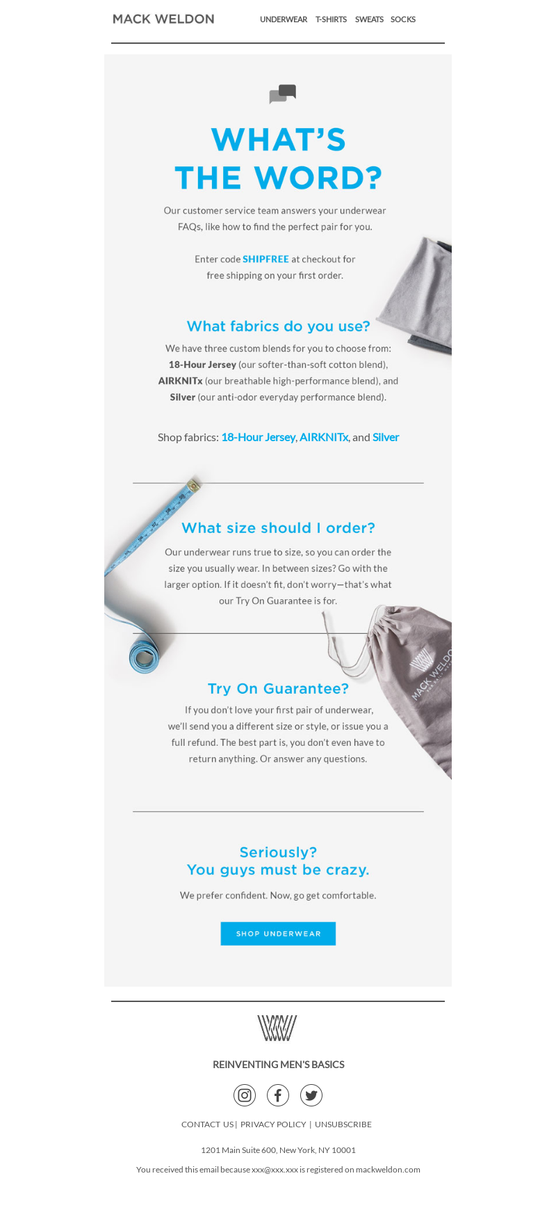
In the second email, they move away from the text-like send with a more visual template.
We love this welcome email because it uses the Q&A format to mention the different fabrics available, product sizing, and their guarantee to help you find the perfect pair of underwear or your money back.
Some answers—and free shipping.
Sephora
The initial email in Sephora’s welcome series uses first-name personalization in the subject line to speak directly to recipients and entice them to open it. This email also lists the benefits of shopping online at Sephora, becoming part of the brand’s rewards program, and discovering exclusive products available only at their stores.
We love that they incorporated a note at the bottom of their welcome series emails to give readers a taste of what’s to come.
Welcome to Sephora, Roger! 🎉
There are two remaining emails in this sequence where Sephora focuses on in-store events, includes a questionnaire to get a better idea of subscribers’ beauty needs, and invites them to check out popular products.
Roger, let’s get to know each other 👋🏽👋🏿👋🏼
Birchbox
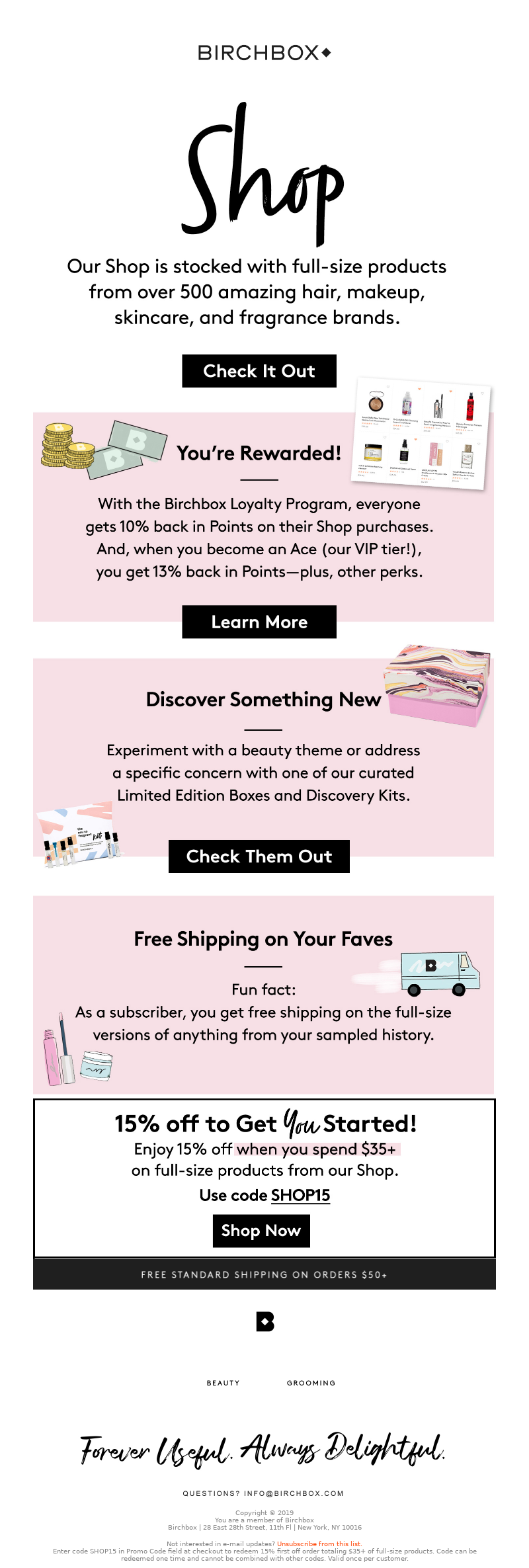
Just like Sephora, beauty subscription box Birchbox uses big cursive headings to make their welcome series emails stand out. The four emails in this sequence all have a theme, with the first giving new subscribers an overview of what their subscription entails.
The remaining three emails are sent over the next 7 days to newly created subscribers.
Welcome to Birchbox!
The second email tells customers how they can get the most out of their subscription while the third introduces them to the shop and the loyalty program. It also offers them 15% off to start shopping now (check out the third email below).
Let's Talk (Birchbox) Shop
The fourth and final email of the welcome series invites users to connect and engage with the brand by following them on social media, reading their magazine, and downloading the app. We love this approach as it engages the users past their products page and interacting on social media.
Beyond the Box
Wynd
Air purifier Wynd has a short three-email welcome sequence sent over three days.
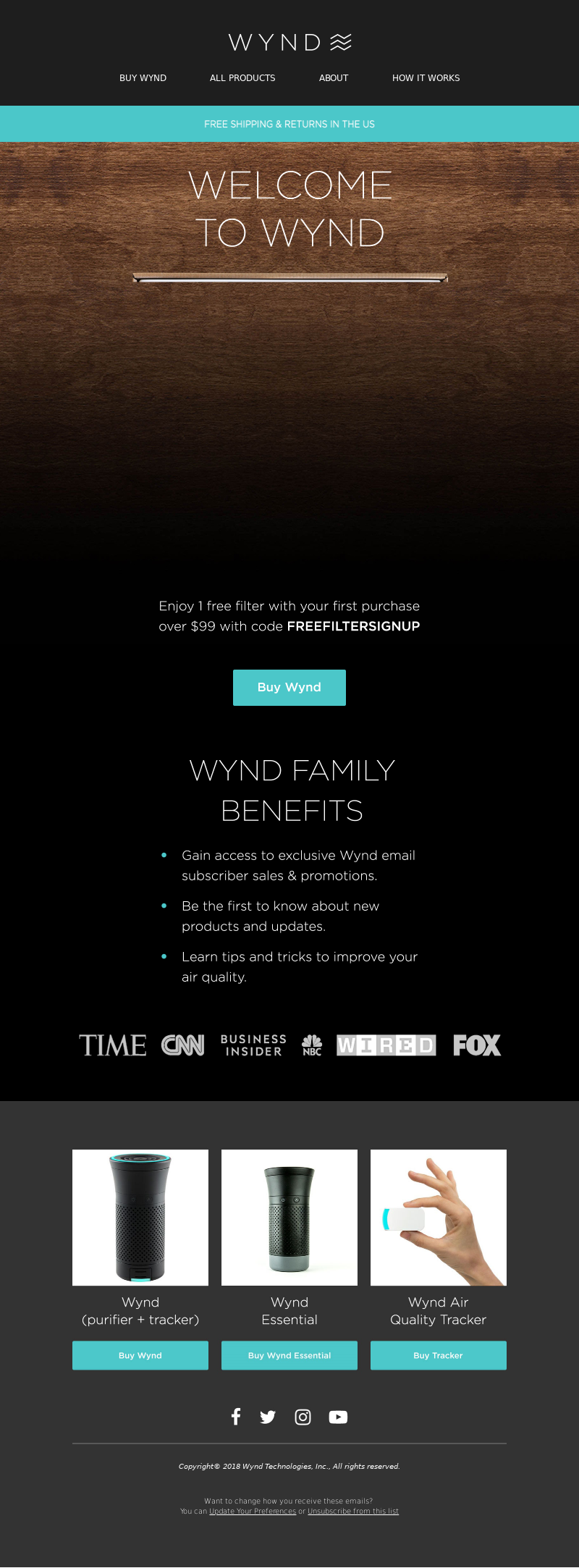
In the first email, the brand offers subscribers a free filter with their first purchase of $99 or more and reminds them of the benefits they enjoy as a subscriber.
Welcome to Wynd
The second email focuses entirely on product details and what makes Wynd’s purifiers unique. It also highlights additional benefits of shopping with Wynd, such as free shipping, a 30-day money-back guarantee, fast customer service, and the brand’s commitment to helping local communities.
Your Personal Smart Air Purifier
The third and final email features a letter from the co-founder of Wynd highlighting the company’s mission to help people understand the importance of air quality and the impact of air quality on health. The letter is followed by real customer reviews driving home the product’s value and benefits.
Why I Founded Wynd
Sugarfina
Candy store Sugarfina has a two-email welcome sequence that offers subscribers a free treat and shares information about their products with a behind-the-scenes video of how some of their candy is made. This is a great way to engage shoppers with the brand and give them a VIP experience.
A Welcome Gift Just For You
The second email reminds subscribers to redeem their free treat as the offer is expiring soon and highlights their luxurious ingredients as well as boutiques for a truly high-end candy shopping experience.
This email also drives users to purchase at their in-store locations and features an assortment of animations throughout the email to bring the fun, upbeat brand to life.
Your Sweet Gift Expires Soon
Adidas
Adidas’s welcome email sequence asks users to complete their profiles so they can get customized recommendations and event invitations. Adidas also shares a limited-time 15% savings offer that’s promoted throughout all three welcome emails.
You're in. Welcome to adidas.
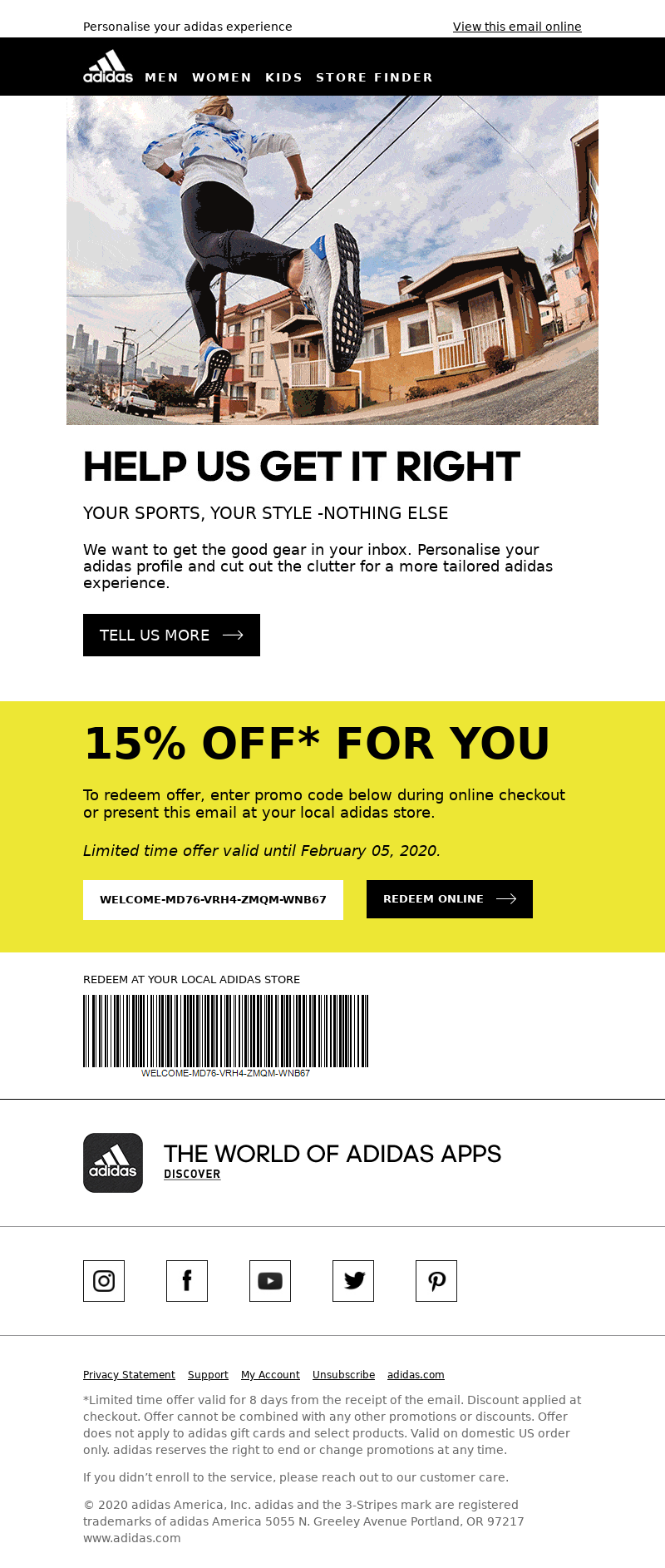
Below is a look at the brand’s second email sent 5 days after newsletter signup. We love that Adidas keeps it short, sweet, and to the point, while highlighting (quite literally) their custom coupon code.
By keeping the email brief subscribers have their attention focused on the two main CTAs: Tell us more about you and redeem your coupon.
Tell adidas what you like, we'll send you things you'll love
Starbucks
Starbucks’ rewards program is, not surprisingly, first class.
The first email sent to new rewards members welcomes them to the program, explains the perks, and shows them how to use the Starbucks app. We love that Starbucks uses simple images (including fun animated GIFs) and limited text to tell a story without overwhelming customers with information.
Welcome to Starbucks® Rewards
In its second welcome email the brand educates new rewards members on a central perk: Ordering ahead to get exactly what they want through the Starbucks app. Again, this is more educational than sales-heavy, and ultimately improves the customer’s in-person experience, too!
Can we get your ☕ started?
Get subscribers engaged from the start
A solid welcome email series is crucial to keep the momentum going once someone has decided to sign up for your email list. Tell your brand story, offer a discount code, or use any of the other example tactics in this article to keep new subscribers engaged.
Want more welcome email series examples? Sign up for a free MailCharts account today! We track emails across a variety of industries including home, fashion, baby, and more.
Editorial photo by Bernard Hermant on Unsplash


